Google speakers don't stand out, and that's a good thing
They're designed to make tech more approachable.
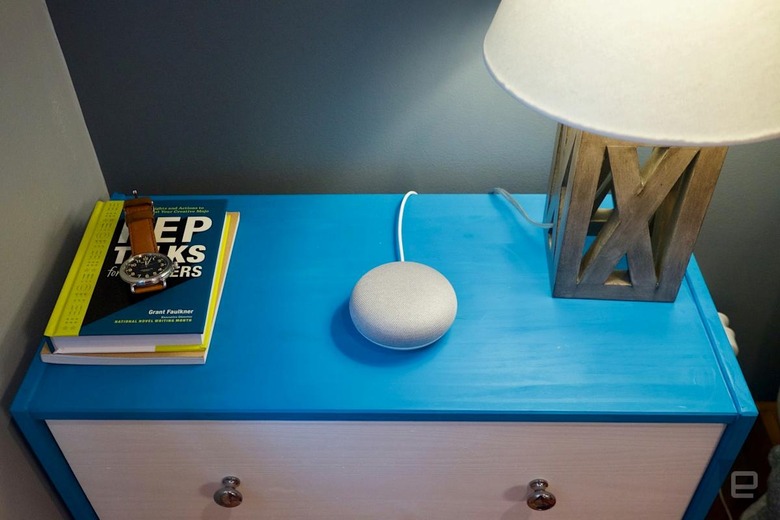
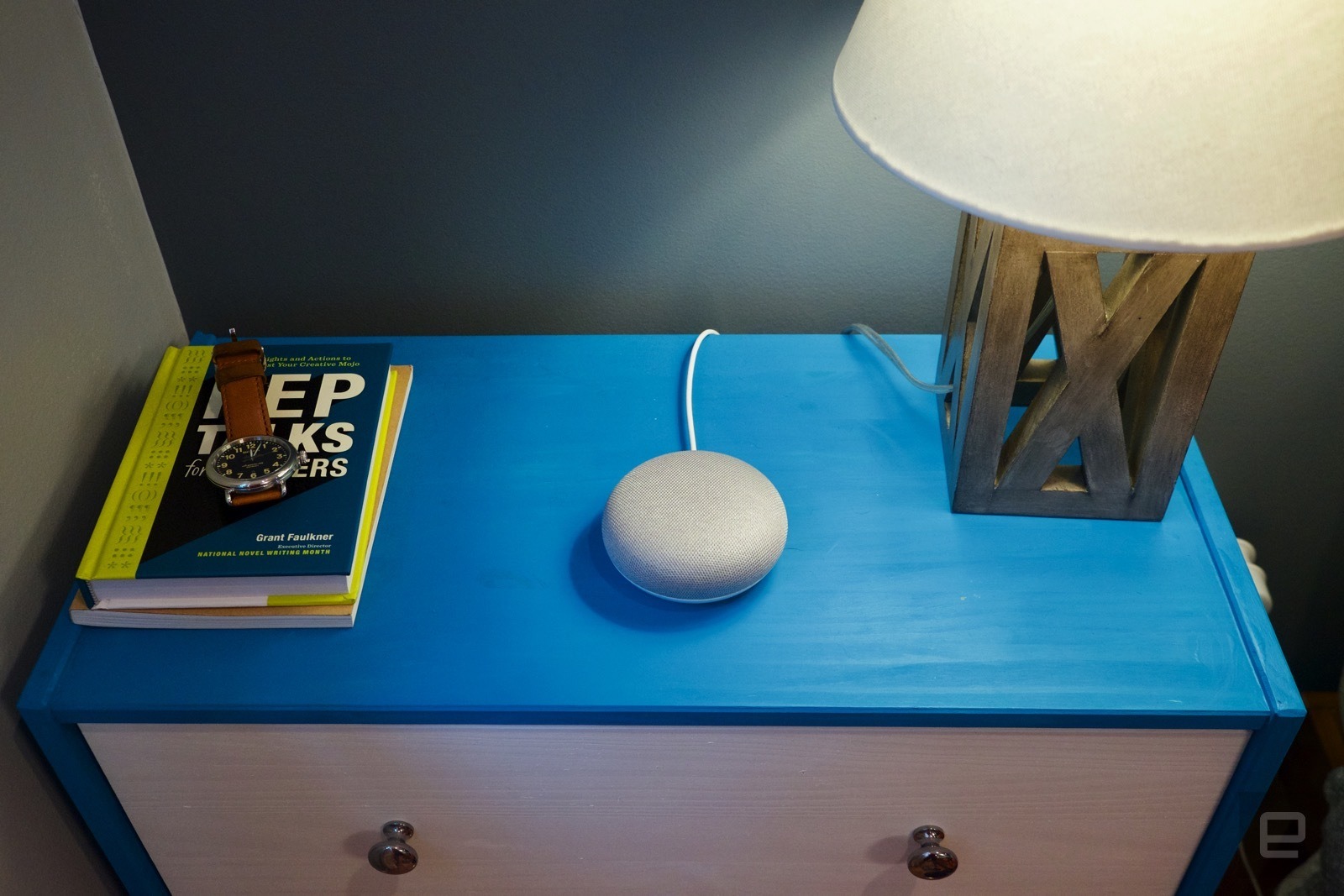
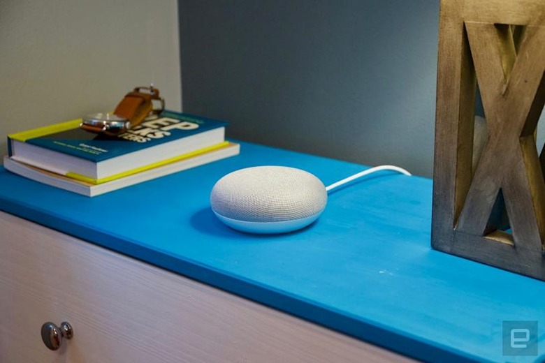
Two years ago, Google unveiled the Home, its first-ever smart speaker. Unlike the Echo, with its tall, cylindrical shape that seemed like an over-sized router, the Home was short, stout and decidedly more friendly in appearance. Google followed that same design philosophy with last year's Home Mini, a fabric-wrapped shell that looked more like a piece of home decor than a smart speaker. Of course, the Home Max does look more speaker-like as that's its primary purpose, but it still has the fabric-clad aesthetic. The underlying design philosophy behind all of it: To look as unobtrusive as possible.


"For us, the main goal with everything that we create is to fit into people's lives," said Isabelle Olsson, the head of industrial design for Google's Home products, to Engadget. Olsson has a long history of art and design, and was also the designer behind the original Google Glass. She joined the team after the launch of the original Home speaker, as the company decided to build out a design department just for Google's Home products.
One of the ways Olsson and her team approached the design of Google's Home products is to help people think of them as a softer side to technology. "Think of the busy city, with dark and blinking lights into the night. Then you wake up in the morning, and the snow has fallen, creating this calm and quiet."
This sense of serenity, she said, is what the company wants to achieve with its products. "We want to reduce the complexity of technology." That goal isn't particularly unusual in the consumer hardware space, but Google's approach seems to at least be better than others. The curves and soft finishes of its smart speakers certainly exude a far cozier feel than the industrial look of early Amazon Echos.
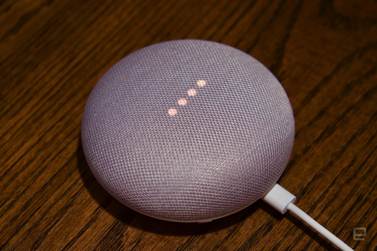
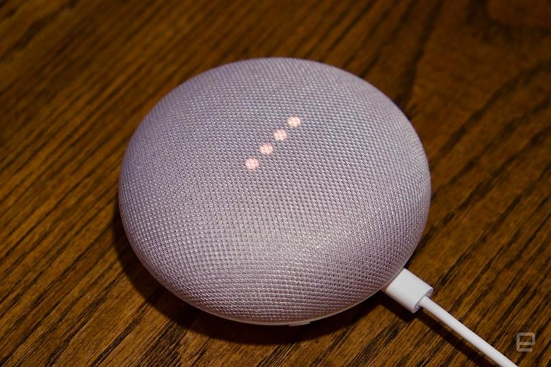
But serenity, it turns out, is hard work. Not only did Olsson need to make sure the hardware is functional as well as beautiful, the manufacturing of the speakers also needed to be just right. Olsson said that the team went through 157 shades of gray to develop the original Mini and made a custom textile. "We created this material from scratch, right down to the yarn," she said. "It's durable and soft, but also transparent enough to let through both light and sound." It's not exactly a detail that many people notice, but compared to the hockey-puck look of the original Echo Dot, it does indeed look more appealing.
"By using materials in an unexpected way for consumer electronics, such as fabric on Home Mini, we were able to create a product that feels like it belongs in the home, while letting all the tech fade into the background," said Olsson. "We really want to make sure that we can design products that can fit in different rooms in the household." While Amazon's original Echo seemed to adhere to a "'90s black" aesthetic where hardware was seemingly designed to fit in the living room and nowhere else, Google has tapped into this notion that technology belongs in all parts of the home, and should therefore design its devices to match.
That's perhaps why the Mini, and not the original Home or the Max, became the unlikely star in Google's Home lineup. "The Mini is such a versatile product. It's the idea of the Assistant in every room; the laundry room, the bedside table, etcetera. It can really go anywhere." That's part of the inspiration behind making the Mini in different colors as well, such as the orangey pink Coral and the minty blue Aqua announced last week. In the second-quarter of 2018, it was so successful that it became the top-selling smart speaker in the world, even topping Amazon's Echo Dot.
Of course, Google isn't the only company with this idea of making technology less obtrusive. Amazon followed this same approach with its own line of speakers with fabric coverings and wood veneer shells last year, and the second-generation Echo Dot is similarly clad in fabric as well. Lenovo too, went with the home decor approach with its interpretation of Google's Smart Display, clad in a white and bamboo exterior.
"We really wanted to design something that deserves to go into your home and really look high-quality and premium while still being able to deliver at a really affordable price point," said Olsson. "Being able to create products that a lot of people can access but still meet that quality bar, both aesthetically and functionally, is definitely one of our biggest challenges."
But the company's biggest hurdle yet may be in making its own version of the smart display, which is rumored to be the Google Home Hub. Images seem to indicate it has a simple, minimalist look that does match the current smart home lineup. Yet, it also looks a little boring and uninspired, and its rumored $150 price might point at lesser-than-ideal specs. We'll just have to wait until tomorrow's event to see.