Twitter's Android app gets the Material Design treatment
It's rolling out to everyone today.
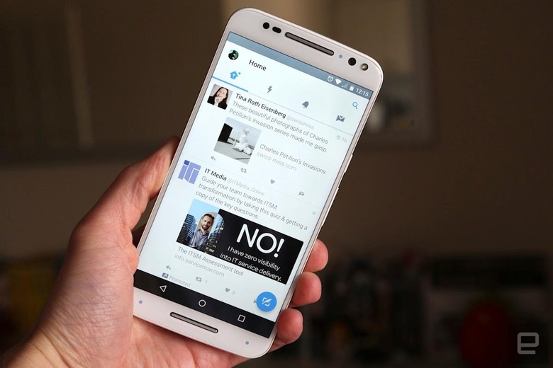
What was once a test is now official. Twitter is rolling out a new version of its Android app which adheres to Material Design, the paper-like visual language developed by Google. The app is now split into four tabs — Home, Moments, Notifications and Messages — which you can move between by tapping the icons at the top of the screen, or using a horizontal swipe. Dragging across from the left-hand edge will reveal a side menu with shortcuts to your profile, lists and Twitter highlights. The drop-down arrow at the top of the menu will let you switch accounts, meanwhile.
The visual revamp isn't a huge surprise given how keen Google is for developers to embrace Material Design and its various principles. What is notable (but no less surprising) is the placement of Moments inside the new app. The feature is truly front and center now — an attempt by Twitter, no doubt, to make the news-centric hub more popular with users. What was once known as "Project Lightning" has had little effect on Twitter's stagnant user numbers, but CEO Jack Dorsey will be hoping that can change now that it holds such a prominent place in the Android app.