iOS 10 preview: Apple's software takes a big step forward
The beta works as a daily driver, but tread carefully anyway.
Rumor has it that Apple isn't going to reinvent the iPhone this year, but you definitely can't say the same about its software. iOS 10 was unveiled to the world late in the company's Worldwide Developer Conference keynote, and for good reason — there were many, many new software features to unpack.
And now it's time to play. Assuming you have the guts to install unfinished software, you'll be able to grab the iOS 10 public beta soon (as long as you're part of the Apple Beta Software Program, anyway). As a quick reminder, the preview is compatible with the iPhone 5 and newer, the iPad mini 2 and newer, and the sixth-generation iPod touch. Before you choose your sacrificial iDevice, though, read on to get a better sense of what works in the beta, what doesn't and how Apple's approach to software continues to evolve.
[embed=https://www.yahoo.com/first-look-ios-10-public-141429327.html?format=embed®ion=US&lang=en-US&site=finance&player_autoplay=false&recommendations=false]
The caveat
I've been using the public beta build on an iPhone 6s for two days, and so far it's been remarkably stable. Don't get me wrong, I've already encountered a handful of hiccups and bugs, but I haven't run into any full-blown showstoppers either. Still, if you'd prefer not to troubleshoot or restart your phone, you're better off steering clear of the Apple Beta Software Program. But that goes without saying.
Here's what you need to keep in mind: Not all the features Apple previewed at WWDC are live yet. In fact, some of the most interesting ones aren't. (Same goes for Apple's macOS Sierra preview, as a matter of fact.) Most of Siri's improvements center on linking up with third-party apps to let you send money through Square Cash, for instance, or tracking runs with MapMyRun just by asking. Sorry! You can't do that today; it'll be a few months yet before developers get their SiriKit-enabled apps ready.
Ditto for applications like Skype and WhatsApp: When updated this fall, they'll display calls on your lock screen as though they were regular phone calls. This version of iOS 10 also doesn't consistently transcribe your voicemails either or get lyrics for your songs or let you use Apple Pay on the web. The list goes on. Suffice to say the software going live today is just a taste of the software Apple plans to ship in the fall.
The look
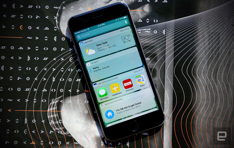
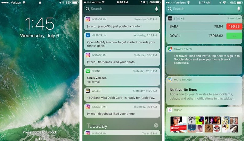
It'll likely be a while yet before we see a redesign as thorough as what we got with iOS 7, but, hey, iOS 10 still feels like a refreshing change of pace. Apple's typeface is thicker by default, and notifications and widgets are neatly contained in bubbles, all of which goes a long way toward making things feel cleaner. Speaking of notifications, you can use 3D Touch on supported iPhones to take action without even having to jump between apps. Think giving a Facebook message a thumbs-up or archiving emails in Outlook. Alas, you can't do any of this while the phone is locked.
Those bubbly new widgets appear when you use 3D Touch on supported apps too, and from there it takes one more touch to add it to your Today feed. They can be a little temperamental, though: Only after two days of testing did the weather widget finally decide to display the outside temperature. (The answer: too darn hot.) Naturally, Apple redesigned lots of other bits and bobs for this release. The Control Center you invoke by dragging up from the bottom of the screen has been split into two pages, one of which is reserved for music controls.
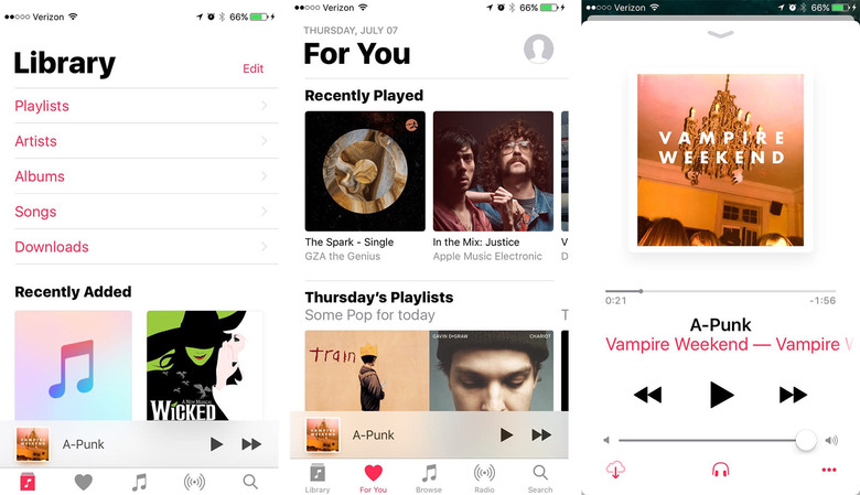
Now back to the big, bold aesthetic Apple is pushing this year: It can be hard to avoid. Perhaps the best example of this is the radically redesigned Music app, which is ... divisive, to say the least. It's all about punchy colors and extreme legibility. I don't mind it, but others who have seen it are not thrilled. Pro tip: You can change the font size used in the Music app from the device's settings. This new aesthetic carries over into other redesigned apps like Health (which now also lets you opt in for organ donation) and the Clock app (which now has a bedtime mode to keep you well rested).
The fun
Nearly all the neat features in the updated Messages app work fine. You can "handwrite" notes by turning the iPhone on its side, send heartbeats with digital touch, leave "tapback" reactions on things people send you and more. My favorite so far: using bubble effects to basically yell at other people using iOS 10. Quickly sending GIFs with the included #images iMessage app is a close second; in case you forgot, Messages is one of those Apple-made apps that will soon benefit from third-party developer support. For now, though, the only other available iMessage apps let you share your recently played music or share animated images like the ones Apple uses on its Watch.
It's also now dead simple to share a recent photo, since you have a live camera preview as soon as you tap the photo icon. One touch snaps a shot and preps it for sending, though there's a noticeable delay in this beta build. Oh, word to the wise: If you don't want to get caught in flagrante delicto, hold off on sending racy messages. If you send a message obscured by invisible ink to someone who doesn't have iOS 10, the message appears normally with a follow-up that says "sent with invisible ink." The app sometimes says the secret message hasn't been delivered to the non-iOS 10 device, but it almost always is.
Apple has added plenty to the traditional messaging experience and it's all pretty fun, but it sometimes feels like a bit much. Apple is facing stiff competition from Snapchat, Facebook Messenger and others, but with all that's going on here, I can't help but think the company is throwing stuff against a wall to see what sticks.
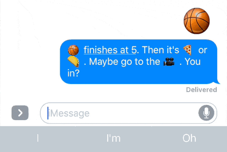
It's not strictly part of the upgraded Message app, but there's a lot of fun to be had with the keyboard as well. By default, the keyboard suggests an emoji when it detects a word that matches it. If you switch to the emoji keyboard in that case, all the words that can be emoji-fied glow orange. Tapping any of them replaces the word with the pictograph. Too bad that other keyboard tricks, like free-time suggestions based on your calendar, don't seem to work all the time yet. For now only specific phrasing (like "I am available at ...") seems to trigger the schedule suggestion.
The helpful
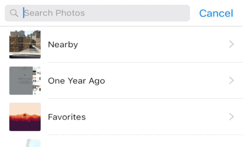
You'd be forgiven for thinking Apple didn't do much with its Photos app; at first glance, there aren't many obvious changes. (Your albums are now laid out in a grid instead of a list, so enjoy.) The biggest difference here is that iOS doesn't just use your photos' metadata to organize everything; it can organize them based on what's depicted in them too. It's a lot like Google Photos, except all the machine learning magic happens on the phone itself. The downside? If you have a ton of photos like I do, it takes iOS a long time to initially scan them all. Side note: Don't be shocked if this blows through your battery.
The results are usually great. You can now search for broad categories like "cat" or "drink" or "bikes" in addition to places, and the results have been almost completely been right on the mark. One search result for "bikes" returned a photo from Barcelona where a moped lay at the bottom of the frame, shrouded in shadows. Not bad, Apple. Your photos automatically get bunched into Memories too, like "best of the year" and "last weekend." There's more to memories than an array of photos: You'll get to see where the photos were taken and who's in them.
It's too bad the auto-created video montages ("memory movies") have never loaded properly for me. Maybe your luck will be better than mine. On the plus side, you can edit Live Photos now, and all the changes you make apply to the still and the video that surrounds it. Live Photos still aren't my jam, but this is a welcome move nonetheless.
Engadget's parent company might own MapQuest (which is apparently still a thing), but I'm all about Google Maps. My devotion has been more or less unwavering, but Apple Maps in iOS 10 scored major points with me, thanks to the improved (and enlarged) navigation interface. Seriously, it's so much easier to read at a glance than Google Maps that I can almost see myself switching. There's also a little weather display in the corner, and the app is better about suggesting places you might want to go and how to get there. You'll eventually see other apps like OpenTable hook into listings you find in Maps, but we'll have to wait a few months before that functionality becomes available.
The overdue
There's a lot more going on with the Music app than a new look: The whole flow has changed. By default, you're dropped off in the Library upon launch, where you can access all the songs you've saved or downloaded. Simple enough. It's the For You section that seems to have gotten the most attention. Instead of just giving you a bunch of random playlists you might like, Apple now does a better job of explaining why its choices might be up your alley. The Connect tab is gone this time, so posts from acts you follow are in For You as well. Thankfully, they're buried at the bottom and easy to ignore if you find them as utterly pointless as I do. Perhaps the most important interface change is that search gets a tab of its own, making it easier to find your perfect summer jam.
Like Music, Apple News also received a facelift that's heavy on bright colors and large text. And again, the biggest change is the For You section, which is to say it now actually works. The Top Stories were the same between devices running iOS 9 and the iOS 10 beta, but the update brings subsections of stories that seem better tuned to your interests. In my case, those subsections included the Middle East, currency markets, startups and technology — all things I dig and have searched for recently. Throw in notifications for breaking news and we finally have an Apple News that feels like it's worth using.
The odds and ends
Not everything fits neatly into a box, but here are a few changes to the iOS formula that you should definitely be aware of.
- Yes, you can remove Apple's first-party apps, and yes, it is glorious. Technically, it's just user data that's deleted; the app itself remains hidden on the device, but I'll take that symbolic victory.
- Raise to Wake does exactly what it says, and it works remarkably well for checking the time and your notifications.
- You can swipe left from the lock screen to launch the camera. (It takes a little getting used to.)
- I didn't always love how fast the TouchID sensor worked on the 6s and 6s Plus. Coincidentally, Apple now requires you to push the home button to unlock instead of laying a finger on it. No more inadvertent unlocks (though you can revert to the old way in settings)!
- You can access Spotlight search from just about anywhere, since the search bar now appears at the top of the drag-down notifications shade.
- Apple's Home app is pretty (there's that bold aesthetic again), but I couldn't properly test it since I didn't have any HomeKit gear on hand. Check back for our impressions in our eventual full review.
We can't issue a verdict on iOS 10 until it launches this fall, but Apple has taken some significant steps forward here. iOS 9 built the foundation for a lot of these features, and with iOS 10 we're seeing Apple try to figure out how they best work together. Sometimes that means rewriting the rules, and other times that means letting people build on top of the existing platform. How well that will work is the big question, and we should have our answer in a few months.
