iPadOS 14 hands-on: Design updates galore
Here's what you can expect from the new public beta.

If you’ve been itching to test all of the new iPad features Apple touted during its WWDC keynote last month, today’s your day: You can download and install the iPadOS 14 public beta right now. That’s probably all some of you needed to know, but if you’re still ready, be sure to take the usual precautions. That means backing up all your data before you take the plunge, and installing the beta build on a secondary device if at all possible.
As you might have already guessed from the name, iPadOS 14 is based on iOS 14, which we’ve already started testing recently. Most of the changes that Apple wove into iOS are present on its tablets too, including a smarter, less obtrusive Siri, plenty of tweaks to existing apps and a renewed focus on privacy, so I won’t be dwelling on those much. What’s more interesting -- to me, anyway -- is how the iPadOS’s identity is growing even more distinct, even with all the DNA it shares with iOS.
The best example I can think of is the way these devices approach their home screens. Like iOS 14, this new version of iPadOS includes all of Apple’s new widgets, which come in different sizes so you can control how much information gets crammed onto your home screen. Android fans have been crowing since the WWDC keynote that Apple is extremely late to the customizable widget party, and they’re absolutely right — Google had the right idea and executed it first and better. The upside is that, at long last, iOS is more informative at a glance.
Things are a little different on the iPad. Unlike iOS 14, you can’t just splash widgets all over your tablet's home screen; instead, they’re relegated to the same "Today" sidebar where they've lived since the first iPadOS release last year. And, unlike on iPhones, they’re still only visible when the iPad is propped up in landscape mode.
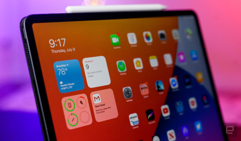
These won’t be a huge issue for many, since the way widgets are displayed hasn't gotten any worse -- it just hasn't changed. Still, it's bound to be a bummer for anyone who really wanted to trick out their iPads. (For what it’s worth, Apple says it focused more on tuning the widget experience for iPhones in this release) And in any case, another decision Apple made about iPadOS 14’s home screen is far more questionable.
Apple introduced the App Library in iOS 14, which serves as a single repository for all of your installed apps. The funny thing is, it's completely missing in iPadOS. Instead, you're meant to manage your folders and multiple home screens the same as always, which feels like a notable misstep here. Yes, iPads have bigger screens, so it's easy enough to pick out specific apps as you scroll through multiple pages. They also have a dedicated dock to store your favorite or most frequently used apps, so iPads are naturally a little more organized than iPhones. The thing is, iPads aren't immune to clutter, and I'm the kind of person who constantly grapples with my messy home screens. Adding the App Library, even as a totally optional feature, would've been helpful to anyone who wants more control over how they organize and access their apps.
Thankfully, other interface changes can feel more immediately satisfying. (Emphasis on “can.”) The search experience in iPadOS used to give you a little bit of everything, but now the search panel works a lot more like Spotlight does on a Mac, offering quick access to information on the web in addition to what’s on your device. Let’s say you punch in “Lightroom” as a search term. In iPadOS 13, you’d get search results that full up your entire screen, offering a shortcut to the app (if it’s installed), its settings, similar apps in the App Store, and some websites Siri suggests.
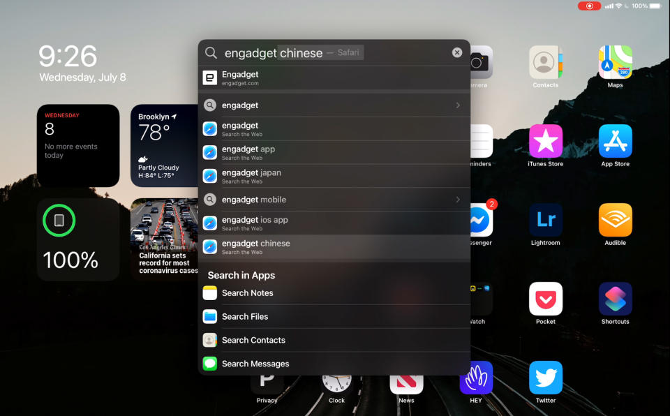
With iOS 14, though, those results appear in a smaller, self-contained panel that includes links to the installed app, a shortcut to a search for that exact term (plus related ones) in Safari, and the option to search for that term in other apps, like Notes.
I’ll tell you this right now: Not everyone will appreciate this change. While the old approach did take over the entire screen, it offered just about every result you could imagine. With iPadOS 14, Apple went with a more focused approach, with the option to dig in further when you need to. The same breadth of results is still there; Search just doesn’t display all of them by default anymore. This new universal search in many cases feels faster, and I personally prefer this new, cleaner take — most of the time, the very first search result is exactly what I was looking for anyway. Still, expect to grumble for a while if you enjoyed Apple’s old, “here’s a bit of everything” approach.
While we’re on the subject of redesigns, some of Apple’s first-party tablet apps have been tweaked to better match their desktop counterparts. Just look at the Calendar and Photo apps: Both now feature prominent sidebars when you swipe to the side, offering fast access to options and controls that normally would’ve been scattered about. They’re not alone, either: You’ll find similar sidebars in Apple’s Files, Notes and Music apps.
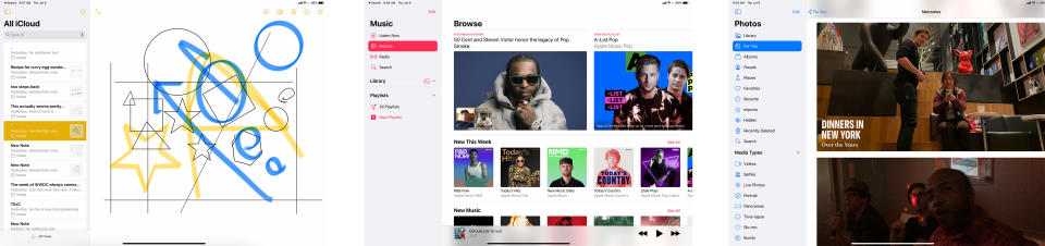
That really shouldn’t be much of a surprise. Apple has been encouraging developers to build iPad apps with Mac Catalyst, which ensures that the same code runs on Mac computers as well as tablets. In other words, some iPad apps are essentially Mac apps, so a little cultural crossover was inevitable. What makes this particular situation more interesting, though, is the fact that none of the redesigned apps I mentioned are built on Catalyst — Apple just felt that merging some historically desktop-y elements into its mobile software was the right way forward. Now, the company may just be applying best practices from one platform to another, and I have to admit that these sidebars make using a trackpad or mouse with these apps easier. Still, when you consider these design changes and the fact that some parts of macOS Big Sur took clear inspiration from iOS, it’s hard not to imagine Apple moving toward a future where iPads and Macs are more similar than they are now. But I digress.
Some of the biggest changes Apple has made to the iPad experience are tied to the totally optional Apple Pencil. The company’s stylus was already a remarkably helpful tool for mobile artists and note-takers, but in iOS 14, you can finally use the Pencil in more places.
You can, for instance, just start writing in any text field. iPadOS will do its best to translate your chicken scratch into proper text, and so far it’s been doing a surprisingly good job. (In other words, you can largely put away the “Eat Up Martha” memes.) You don’t even have to get your pen strokes in the box, either. As long as you’re in the general area, iPadOS will figure out where you actually meant to write, and transcribe your text in the right place. It’s a minor thing, but it means you never have to think too much about making sure you hit your mark exactly.
Of course, the Pencil arguably works best in apps like Apple’s Notes, which has been updated dramatically to better deal with your handwriting. You can, for instance, double-tap anything you’ve written to select it. From there, you can select as much of your scrawl as needed, in case you need to copy it (either as pen strokes or plain text) or move it around the page.
If you’re the sort of person who frequently deals in diagrams, Notes can also convert some of your rudimentary sketches (think: arrows, hearts, and polygons) to geometrically precise figures. I could see this being useful to students and professionals alike, but the feature still needs a little work. It’d be nice, for example, if you could move a line around after iPadOS “quantized” it for a little extra precision. (If you want that kind of control over your sketches, I can’t recommend Procreate enough.)
And if you really wanted, you could also select a new pen tool in the app’s palette that transcribes your writing into text immediately. Fair warning: It takes a lot of getting used to. While iPadOS does a surprisingly good job handling the conversion, there doesn’t seem to be a way to address hand-written typos before they’re committed to text. And you need to be fairly consistent in where and how you write; if you linger too long while collecting your thoughts, the cursor often jumps elsewhere and starts a new paragraph, even if you’re writing in the same part of the screen. Apple seems to be on the right path, but here’s hoping some of these little quality-of-life issues get ironed out before launch.
There’s quite a bit more going on in this update than I’ve been able to get into here, and we’ll address those additions in our final review in the fall. So far, my time with this beta makes me feel like we’re still in the middle of a transitional period. Apple started the work of giving iPads a more distinct identity last year, and iPadOS 14 pushes the company’s tablets deeper into the gulf between smartphones and computers. Exactly where on that spectrum the iPad will land remains in question, but one thing’s for sure: We’re well on our way.
