features
Latest

My top five products of 2014: Mike Rose
It's been all apps, all the time around here as we wrap up our favorites of 2014. For a change of pace, I thought I'd pull together my favorite five products that don't necessarily require a visit to the App Store. Apple Pay & Touch ID (included with iPhone 6/6 Plus, coming for Watch). It doesn't feel good to skip an iPhone generation, as much as we claim to be "waiting for the next one" or "really fine with the phone I have now." In my case, a work-owned iPhone 5 was holding its own when the 5s premiered, and I couldn't really justify forking over the monthly service costs for a second phone. As a result, my first real Touch ID experience, on my recently upgraded 6 Plus, coincided almost exactly with the launch of Apple Pay. I can't say it strongly enough: Apple Pay is what Touch ID was built for, and it's one of the most vivid examples of Apple's user-first interaction design I've ever had the pleasure of using. Touch ID on its own is dandy; the iOS 8-enabled use of the thumbprint unlock in third-party apps (1Password! Finally!) and in the App Store makes it especially useful, as if unlocking your device at a touch wasn't enough. (I'd only had my new phone a few days before I found myself grumbling as I picked up my iPad -- "What, I gotta put in my passcode? Like a caveman?") But oh my, Apple Pay. Putting the power of the payment network and NFC hardware behind that little fingerprint sensor triggers a seismic shift in the way I think about using my iPhone every day. From prescriptions at Duane Reade to supplies at Staples to rides in NYC taxicabs, I'm constantly looking for new places to pay with a touch. No surprise that Apple's feel-good payment platform is beginning to transform our relationship with the overstuffed old-fashioned wallet. STM Linear for MacBook Air 13" (stmbags.com, about US$60). I'll confess that when I bought myself an STM Linear shoulder bag, it was a consolation purchase; my original object of desire was the elite and often sold-out Tom Bihn Ristretto. I was looking for a shoulder bag in a vertical profile, keeping the laptop upright and providing a lean silhouette as I carried my gear around at trade shows or meetings. Since the Bihn bag wasn't in stock when I went looking, I fell back to the STM -- and I haven't regretted it for a moment (nor did I mind that the STM bag is about half the price of the Ristretto). The Linear has enough space for the MacBook, an iPad, cables cords etc. without feeling cramped or overpacked, and the smaller capacity vs. a messenger bag or backpack keeps me from overloading when I step out the door. The Roost Stand (therooststand.com, $75). After meeting the Denver-based Roost team at Macworld/iWorld in the wake of their successful Kickstarter, I thought this unusual foldout laptop stand would be a great fit for my desk. It's portable, light and tough as a Colorado winter, and can be adjusted as needed to hold most portables securely. What I didn't expect was how viral the Roost would become; at least four co-workers have gone ahead and bought their own Roosts in the months since. If you work in an office, be sure to put your name on your Roost so it doesn't wander off. iMac Retina 5K (apple.com, starting at $2499). Who says the desktop is dead? Apple's jaw-dropping all in one model reset the notion of what a desktop PC should look like, even with a wallet-busting sticker price (in fairness, Dell's 5K monitor alone would have cost as much as the iMac, if not for a price drop after Apple's introduction). The Retina iMac is so delicious that even jaded tech writers find themselves compelled, like the NY Times' Farhad Manjoo, to take one home and give it a prominent place on their desks. I haven't replaced my 2011-vintage iMac just yet, but when I do I'll be saving up for the Big Kahuna. Jawbone ERA (jawbone.com, $99/$129 with charging case). I have never had much luck with Bluetooth headsets; whether it's fit or function, they just don't seem to work for me. Other than LG's Tone Pro around the neck headphones -- which provide great stereo sound at the cost of mediocre phone calls and "looking like a huge dork" -- I hadn't found a solid choice. That's why I've been so pleased with the new-generation Jawbone ERA, which works great for phone calls and conferences without being horribly obvious. Jawbone's noise reduction is adequate to a busy city street, and with the current firmware the hardware button can serve as a mute switch on calls (life-changing). The ERA is not cheap, but if you've struggled to find a headset that works the way you do, it's worth a look. Honorable Mention: Pebble (getpebble.com, $99/$199). It's black-and-white, not color. It's not touchable or speakable. It is decidedly not an Apple watch, but in many ways it's a better first wearable than a yet-to-ship Watch could be. Why do I enjoy my Pebble? Five days or more of battery life, for one thing. Waterproof enough to wear in the shower. Notifications that let me see who's calling, emailing, texting or tweeting at me without having to haul the 6 Plus out of my pocket fifteen times an hour. And a reasonably active app/developer community delivering cool hacks on a regular basis. No, I won't promise not to look longingly at the next shiny device coming from Cupertino soon. But I'll be looking with the benefit of a lot of experience with the first generation of wrist-based tech.

The one feature Apple should seriously copy from BlackBerry OS 10
Do you own a BlackBerry? Of course you don't. Nobody's owned a BlackBerry since 2009 or so, but despite that I decided to pick up the BlackBerry Classic to replace my HTC One M8 as my non-iOS phone and I actually don't hate it. With its multitouch screen it's a lot like a cross between iOS and Android, but it happens to have a feature than neither of those two much more popular options have out of the box, and I love it. I was sorting the bounty of stock apps that came on the device when I realized I had created two folders by accident. If I were on my iPhone, correcting this mistake would mean taking all the apps out of one folder and putting them into the other one, one at a time. I was prepared to do just that, but first I decided to just toss one of the folder icons on top of the other, expecting it to push the other folder out of the way and leave both folders intact -- as it would on iOS and Android. To my astonishment, BlackBerry OS 10 has a built-in "Merge Folders" feature. How on earth does BlackBerry -- the company that is literally gasping for breath while Apple and Google casually erase them from the history books -- have a better handle on app management than its competitors? Apple, it's time to fix this.

Limefuel Dual Port USB 4.8A Wall Charger: Tiny and powerful
Another day, another great product from Limefuel. Yesterday we took a look at the company's big-capacity Blast L240X Pro external battery pack, and today we're looking at something that's quite a bit smaller, yet still packs a lot of power - the Dual Port USB 4.8A Wall Charger (US$16.99). The idea behind this little powerhouse is to give you not one, but two 2.4A USB ports in one easily transportable little box. Instead of filling up your house or hotel room with multiple single port Apple power cubes, all with their nasty pointy prongs sticking out, you can hook two of your favorite Apple toys up per wall outlet. When you're done, the prongs fold away to avoid scratching your other electronic gear. With 24W of power and 2.4A of current per port, your devices will charge quickly. You can use your existing charging cables with the device, which measures just 2 x 2 x 1.1 inches (50.8 x 50.8 x 27.9 mm) and weighs a featherweight 2.7 ounces (76.5 grams). Depending on your preferences, you can get the Wall Charger in black or white. While it may be a little too late to order as a stocking stuffer, the Dual Port USB 4.8A Wall Charger is a perfect gift anytime for you or your favorite traveler. Highly recommended! Rating: 4 stars out of 4 stars possible

Limefuel Blast L240X Pro Battery Pack: Power to spare
Are you feeling the need for power? We've reviewed external battery packs from Limefuel before, but now they've gone crazy big with the new Blast L240X Pro (US$149.99) Specifications Dimensions: 6.1 x 3.1 x 0.9 inches (155 x 79 x 24 mm) Weight: 17.8 ounces (505 grams) Capacity: 24000 mAh / 91.2 WH Charging time: 16-24 hours Total output: 5V/4.2A (Max) Connector: USB to micro-USB/Lightning connector Design Limefuel makes one of the better-looking external battery packs on the market, with rounded sides that are easy to grip and either a rubberized black or white gloss exterior. There's a single button near the "front" of the Blast L240X Pro that is used for all of the functions - turning on the battery pack, checking the level of charge, and activating the built-in LED flashlight. On "top" of the device near that button is a string of green LEDs to tell you the battery level, and on the front face is a single micro-USB input for charging and four USB output ports. That means if you have four devices that need charging at once and you're nowhere close to a plug, you're in luck as long as the maximum total current draw isn't more than 4.2 Amps for all four ports or more than 2.4 Amps for any one port. How much life will the Blast L240X bring your favorite electronic devices? Well, it depends on the model, but Limefuel estimates up to 158 additional hours of internet surfing, 206 hours of talking on your phone, or up to 552 more hours of listening to music - that last number is a whopping 23 days! Functionality The unique flat cable included with the Blast L240X can be used for both charging the battery pack and for charging one of your devices. Plug it into your favorite USB charging brick (not included) on one end and into the micro-USB port on the other, and you're set. You might want to consider one of Limefuel's Dual Port Wall Chargers ($16.99) to load up the battery pack, as they're capable of putting out 24 Watts of power at 4.8 Amps. The huge capacity of the Blast L240X means that if you've drained the battery, it's going to take almost a day to recharge fully. If you have extreme power needs every day, you might want to get two of these devices and trade them out every other day. One of the best features of the Limefuel battery packs is the design. They feel very solid, and you don't have the feeling that the Blast L240X is going to fall apart or break. This thing is built like a tank. Unlike most other external battery packs, the Blast L240X provides pass-through charging so that you can charge devices while you're charging the battery pack. Conclusion The Limefuel Blast L240X offers unmatched capacity and four USB ports, although at the cost of some extra weight. At $150, it's also one of the most expensive external battery packs we've tested. But if you need lots of power while traveling, the Blast L240X is your best companion. Rating: 3-1/2 stars out of 4 stars possible

Logoist 2: Designing logos and more on your Mac
Small business owners, website developers, and others often have a need to design logos, business cards, and more, but can't afford to hire a professional designer to do the work. While designers are your best bet for getting a logo or other artwork that can truly "sell" your business to customers, the recently updated Logoist 2.1 ($29.99, on sale through December 27, 2014 for $14.99) can help you to easily create good-looking, professional illustrations or images. The OS X app is fully optimized for OS X Yosemite, and creates files as images in PNG, JPEG, PSD, and PDF formats. But before you can output your images, you need to create them... Launching Logoist 2.1 displays a splash screen with a showcase of different designs, all of which can be used as a starting place for creating your own work. If you're looking more for a specific type of graphic item - say a logo, greeting card, business card or photo layout - there are tabs for those items as well. You don't have to use the presets, but they may be useful in getting your creative juices flowing. Selecting a preset brings up the example in a separate window that can be expanded to full screen if desired. On those presets you'll see several animated dots - clicking on those allows you to change some of the major features of a specific design. For example, one simple calligraphy logo had one dot for changing the text, while another dot changed the background color. But what if I wanted to do more than just change the text and background color? Well, there's a button to create a new document from the preset, and once that's been created a full editor comes into view. Want to change the text style or rotation? Done. Add shapes, lines, paths? It's in the controls. There are buttons for adding clip art or images, and specific items can be layered for depth or to mask out other items. I found it fascinating that individual letters in a logo could not only be rotated, but that I had total control over items such as line height and kerning. Style changes include fills, motion blurs, borders, a ton of effects from bevels to shadows, and even a "set distorter" to force perspective or warp words. There are so many choices that Logoist 2.1 provides a browser of style presets that you can try out, scrolling through gradients, flat colors, glows, plastic, glossy or glassy extrusions, or even metallic looks. All said, it's possible to make some really hideous choices like the faux TUAW logo seen at the top of the page. Clip art can be added in at any point along with images, and there are a number of combine effects for melding graphic and textual elements. As with most graphic apps, you'll want to be sure to take some time to learn the app so that you don't create nightmares like I did for the examples in this post. That's where the Logoist 2.1 User Guide comes in handy - it's a 51 page PDF document that outlines many of the techniques that you'll want to know in order to master the app. Anyone who needs an app that can help them design logos and cards - or at least show them that they need a professional designer's help - should jump on purchasing Logoist 2.1 while it's on sale through December 27, 2014. It's a powerful tool that can produce great results in the hands of those who learn its tricks and can show restraint.
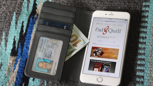
Pad & Quill's Bella Fino wallet case for iPhone 6 Plus
Yesterday I reviewed the Twelve South BookBook for iPhone 6 Plus and loved it; today, we're going to take a look at how another case manufacturer handles the big iPhone with leather. That manufacturer is Pad & Quill, and the case is the Bella Fino for iPhone 6 Plus (US$74.99). In keeping with the spirit of holiday giving, we're also giving this case away, so be sure to fill out the entry form at the bottom of the review. If you'd like 10 percent off of any order from Pad & Quill, be sure to enter the discount code ML44 when checking out. Specifications Dimensions: 6.5 x 3.5 x 0.55 inches (165 x 89 x 14 mm) Weight: 2.2 ounces (62.4 grams) Materials: Leather (Galloper Black, Whiskey, Dark Chocolate), translucent plastic for ID card pocket, 3M adhesive sticker Design If you're not familiar with Pad & Quill's work from our past reviews, then you're missing a lot - the company creates cases, bags, and briefcases, all made primarily from top-quality natural materials like leather and Baltic birch. The Bella Fino takes advantage of the new, thinner design of the iPhone 6 Plus by doing away with the wood frame of the Luxury Book for iPhone 6 Plus ($99.99), which actually doesn't shave any thickness off of the case, but does save 1.8 ounces of weight. As with all of Pad & Quill's products, the workmanship is top-notch. The leather is gorgeous, with perfect strong stitching inside and out. Like the Twelve South case yesterday, the Bella Fino features four credit card slots, an ID slot, and a large pocket for paper money or receipts. The big difference is in how the iPhone 6 Plus is held in place; Pad & Quill worked with another Minnesota-based company by the name of 3M to create a two-part adhesive patch that sticks to the back of your iPhone, yet can be removed without leaving any residue. The Bella Fino for iPhone 6 and 6 Plus. To secure your iPhone we developed a NEW, Minnesota based, 3M clean release adhesive technology. We're not saying it's magic, but it is amazing! #iphonecase #leathercraft #walletcase #iphone6 #iphone6plus #magic #minnesota #3M A video posted by Pad & Quill (@padandquill) on Dec 12, 2014 at 2:56pm PST Unlike the Twelve South BookBook, the Bella Fino cannot be used as a stand for your iPhone 6 Plus. Things that Bella Fino has that the BookBook doesn't? A nice finish that isn't pre-distressed, so if you like beautiful leather you're going to prefer this wallet case. Oh, and there are six different combinations of exterior and interor colors. Functionality The Bella Fino case is incredibly fast to install. Simply remove the paper cover off of the adhesive patch, line up your iPhone 6 Plus, and then press it firmly onto the patch. It sticks to the patch until you want to remove the case, at which time you just need to give your phone a firm tug to release it. If that patch loses its stickiness at some point, you can purchase extra adhesive from Pad & Quill for $5.99. My experience with this material is that it really sticks to the phone very well, unless you remove your iPhone frequently or if the adhesive patch gets dirty. In case you're worried about how your iPhone will handle a drop while wearing the Bella Fino, it's pretty well protected all around the exterior with a bit of extra leather. The only place that's "naked" is the upper right corner, which has a cutaway for the iPhone camera and flash. Conclusion While Twelve South's BookBook is novel in appearance (no pun intended), Pad & Quill's Bella Fino is simply elegant - pure class in an iPhone 6 Plus wallet case. It's something you'd be proud to take out of the jacket pocket of your fine tailored suit, yet classic enough to look good when you pull it out of your jeans pocket. My only concern is the slight lack of protection for the camera portion of the iPhone 6 Plus if the case and phone are dropped. If you love the look of the Bella Fino but have that same concern, spend the extra $20 and pre-order the Luxury Book for iPhone 6 Plus -- and don't forget the 10 percent discount. Rating: 3-1/2 stars out of 4 stars possible Giveaway Nothing says "Merry Christmas" like opening a Pad & Quill Bella Fino for iPhone 6 Plus on Christmas morning! We think we can get this to the winner in time for the holiday, so if you're in the mood to get or give a Bella Fino, here are the rules for the giveaway: Open to legal US residents of the 50 United States, the District of Columbia and Canada (excluding Quebec) who are 18 and older. To enter, fill out the form below completely and click or tap the Submit button. The entry must be made before December 21, 2014 11:59PM Eastern Standard Time. You may enter only once. One winner will be selected in a random drawing and will receive a Pad & Quill Bella Fino for iPhone 6 Plus valued at $74.99. Click Here for complete Official Rules. Loading...

Hands-on with the Twelve South BookBook for iPhone 6 Plus
Twelve South has released its iconic BookBook for the iPhone 6 Plus (US$59.99), and if you're looking for something to replace your thin protective case, your stand case, and your wallet, you've come to the right place. Check out the review, then enter for a chance to win a beautiful vintage brown BookBook for your iPhone 6 Plus. Specifications Dimensions: 6.3 x 3.34 x .79 inches (160 x 85 x 20 mm) Weight: 3.2 ounces (91 grams) Materials: Leather, polycarbonate (for removable shell case) Design All of the members of the BookBook line from Twelve South look like ... books. Not just any books, though - they resemble those old leatherbound tomes that were on the shelf in that one dusty corner of the university library. The covers are beautiful vintage brown or black leather, while the spine of the BookBook is red and black with gold embellishments. Inside the case you'll find a distressed leather wallet with an ID slot, four credit card slots, and a big pocket for cash and receipts. It's probably the first time any manufacturer has actually made an iPhone wallet case that can really replace your old wallet! The surprise is the thin polycarbonate protective shell that the iPhone 6 Plus slides into. Once it's inside the shell, you just slide the entire assembly onto some plastic pins inside the BookBook and it's held securely in place. If you decide the entire BookBook is too big for your current purposes - say, sliding the phone into your skinny jeans - you can pop the shell and iPhone out of the leather structure. That shell and the "pins" also make it possible for the BookBook for iPhone 6 Plus (and the iPhone 6 version as well) to do something no other iPhone BookBook has done before - act as a hands-free viewing stand. The design for the new BookBook for iPhone 6 Plus is not only just as beautiful as before, but adds much more practicality to the case. Functionality The Twelve South BookBook for iPhone 6 Plus has it all: good looks, protection, a built-in stand, and a capacious wallet. There's no need to say much more than that, other than at $60 it's a bargain. Conclusion While the BookBook for iPhone 6 Plus might not be for everyone - I mean, it IS hard to put the whole ball of wax into a single pants pocket - it's perfect for the person who carries a purse, briefcase or computer bag. Between the timeless design and the ability to use the BookBook as a wallet, stand, and protective case, this case is a winner. Rating: 4 stars out of 4 stars possible Giveaway As much as I drooled over this case (not literally, OK?), it's not for me as I really need an iPhone 6 Plus case that I can stick into my pants pocket all the time. So one of you lucky devils out there is going to get a beautiful vintage brown BookBook for iPhone 6 Plus. I envy you. Here are the rules for the giveaway: Open to legal US residents of the 50 United States, the District of Columbia and Canada (excluding Quebec) who are 18 and older. To enter, fill out the form below completely and click or tap the Submit button. The entry must be made before December 20, 2014 11:59PM Eastern Standard Time. You may enter only once. One winner will be selected in a random drawing and will receive a Twelve South BookBook for iPhone 6 Plus valued at $59.99. Click Here for complete Official Rules. Loading...

Vivitar DVR794HD Action Cam: You get what you pay for
Like many TUAW readers, I'm one of those people who has been drooling over the GoPro Hero4 Black action camera since it was recently released. But at US$500, it's a bit on the high side for someone who doesn't actually engage in a lot of activities that would would benefit from the high definition video - I don't skydive or scuba dive, and I'm not a snow or skateboarder. So I was fascinated to hear about a much less expensive Wi-Fi enabled action camera from Vivitar - the DVR794HD (US$99, £75.99), and quite happy when the venerable camera and accessory manufacturer offered to send a review unit, even when it's not available yet in the US. Read along to see how the DVR794HD works (or doesn't...) in the Apple ecosystem. As with most of the action camera genre, the DVR794HD is tiny - just 2.44 x 1.57 x 1.26 inches (62 x 40 x 32 mm). With the battery installed, the bare camera weighs just 2.8 ounces (79.4 grams). It wouldn't be an action camera without being waterproof, so Vivitar ships it with a clear plastic waterproof housing. There's also a helmet mount for capturing your skydives and heliskiing, and a handlebar mount for those times where you're racing through the pines on your mountain bike. They don't include one necessity - the MicroSD card that photos and videos are stored on. However, those are really quite inexpensive, with a 64 GB Class 10 MicroSD card selling now for as little as $25 online. Setting up the camera is simple and fast; you just pop the included battery pack into the back of the unit, plug the camera in until a small blue LED goes out, and then you're ready for action. The waterproof case goes on easily, with a nice snap-on lock that keeps it securely shut. That case is good to 30 meters (about 100 feet), so it shouldn't have any issues with taking a dip in a swimming pool or going snorkeling. Of course, the point of cameras like this is that they're supposed to shoot incredible video through a wide-angle lens. The DVR794HD uses a fixed focus 2.9 mm lens at F3.1, so it certainly fits the bill there. The controls are fairly simple. On one side are a power button and a button for linking to the camera from your iOS device using Wi-Fi and the free Action Cam app. On top is a button to toggle between video and still photography, and also to start and stop video or take a still photo. The only display on the camera is a tiny LCD display that is almost worthless. It shows if the camera has turned on or is turning off, and has almost microscopically small icons to denote video/photo mode, battery capacity, and the remaining duration for the camera while filming. According to the app, at 64 GB microSD card should give me 11 hours and 3 minutes of filming capacity (although the battery won't last that long), but the display just showed 1:03. By the way, on the other side of the camera is the microSD card slot, a port for an external microphone, a micro-USB port for charging, and an HDMI port for viewing your output directly from the device. To power on the DVR794HD, you long-press on the power button. By long-pres, I mean about five seconds. A barely audible beep tells you that the camera is turned on, and the LCD shows "On". To link to the camera via Wi-Fi, you press the Wi-Fi button and it begins to blink on and off. Selecting the camera (ActioncamXXXXXXX) in Wi-Fi settings makes the Wi-Fi light go to a steady red glow. One interesting bug - being connected to the DVR794HD Wi-Fi, my iPhone 6 Plus didn't show the usual Wi-Fi icon. However, opening the free Action Cam app showed a connection to the camera. Tapping on the button, I immediately received an image from the camera showing me what it was seeing. At the bottom of the screen are a toggle for video or photo mode, a large red record button, a time-remaining indicator, and some buttons to set rudimentary white balance and resolution settings. I found the software to be relatively useless; yes, the app can be used as a remote control, but the Wi-Fi connection dropped out on a regular basis. About the only thing it would be useful for is setting the resolution, as the manual method of doing that involves pushing the power/mode button repeated times to bring up those miniscule icons on the LCD. When Wi-Fi was turned on and actually working properly, the battery indicator on the camera would sometimes show a drained battery, even when it had just been charged. My suggestion? Don't use the Wi-Fi. There's just no point to it with the poor iOS app and connectivity issues. About this point, I started seeing a number of other issues with the camera and the app. On occasion, the camera would totally lock up to the point that the battery pack had to be removed in order to reset everything. Sometimes the device would simply shut itself off. I would assume that it's an auto power saving mode, but there's no way to set the auto power-off time. So the iOS app is pretty worthless, how about Mac software, AKA "The Vivitar Mobile Experience"? Well, the brilliant minds at Vivitar included an installation CD, which shows just how out of touch they are with the world of Apple. Most Macs haven't come with optical drives for years, and none of them can read the "mini-CD" that was included. A look at the Vivitar website was relatively useless as well - it doesn't even show the DVR794HD as a current model, and there's no software to be found in the scanty online support section. Even Google couldn't help, as most of the links to the Vivitar Experience Image Manager software for Mac actually went to Windows downloaders or to sites that were so questionable there was no way I was going to download anything from them. The app is available for iPad, but I chose not to download it just out of spite at this point. Fortunately, there was a way to get the photos off of the camera - the microSD card had an adapter that could be used with my Mac. How does the DVR794HD stack up? To start with, all images - video or still - are going to be wildly distorted by the wide angle lens. That's understandable, since you're going to be using this device on a helmet or bike to get action videos, right? Still images on this camera are taken at 4000 x 3000 pixel resolution - a 12 MP image. iPhone 6 Plus images are done at 3264 x 2448 resolution, about 8 MP images. Resolution isn't a guarantee of good photos. The DVR794HD images were grainy, colors were off, and the shutter speeds were so slow in some cases that handheld images were blurred. Here are segments of two images (scaled to fit the page, of course) of the same subject under identical lighting. First, the DVR794HD: Now the iPhone 6 Plus: Despite all of those extra pixels, the DVR794HD photo looks like something I shot with my first camera phone in the early 2000s. What about the video? The following two short clips are taken from the same spot under similar lighting conditions. First, the DVR794HD: Next, the iPhone 6 Plus: Sure, the iPhone 6 Plus is not an "action cam". But as a video camera it's much, much better. There's less distortion, the iPhone 6 Plus handles changes in light intensity much quicker, and the colors are much more authentic compared to what was seen with the DVR794HD. Conclusion I've already wasted enough time, both mine and yours, reviewing this product. The Vivitar DVR794HD is yet another example of "You get what you pay for", and the $99 price tag on this action camera should not be an enticement to anyone to buy this, unless you want a digital lump of coal to put into someone's Christmas stocking. Between poor image quality, bad Wi-Fi connectivity, an iOS app that has very limited utility even when Wi-Fi is working, a truly nonexistent Mac app, a tendency to lock up and/or shut down unexpectedly, and an on-device display that practically requires a magnifying glass to make any sense of, I cannot recommend the DVR794HD, even when it does finally make it to American shores. I'll give it a half-star just for having bike and helmet mounts and an infrared remote, and because that waterproof case is kinda cool. But if you really want to shoot action video, get a GoPro and forget this Vivitar product. For $30 more, you can get the entry-level GoPro Hero and I can guarantee you'll much happier, even without Wi-Fi. Rating: One-half star out of four stars possible

Grovemade's beautiful handcrafted Walnut iPhone Case
Grovemade makes some amazing cases and accessories out of wood, and we've covered a few of them before. Recently, a Walnut iPhone Case for iPhone 6 (US$99) came into the TUAW Labs for our inspection, and it's a gorgeous piece of work. Check out this review and then enter for a chance to win this hand-finished beauty from Portland, Oregon. Specifications Material: Oregon Claro Walnut Sizes: iPhone 5/5s ($79), iPhone 6 ($99), iPhone 6 Plus ($109) Weight (iPhone 6 case): 0.7 ounces (19.8 grams) Design The Walnut iPhone Case comes in two parts - a "bumper" that protects the sides of the phone and a back that adheres to the back of your iPhone with a removable adhesive patch. This design results in an extremely light and sturdy case. The wood is hand finished and is quite attractive; there are precisely-machined holes for speaker, Lightning port, headphone port, mute button and camera. For the power switch and volume toggle, wooden pass-through buttons make it easy to control power and volume. And hey, did I mention that the Oregon Claro Walnut looks great? I think Grovemade outdid itself with the Walnut iPhone Case. Functionality As opposed to earlier wood iPhone cases from Grovemade and other producers, the two-piece design makes installing the case a snap. You just place the iPhone into the bumper part, turn the iPhone and bumper over onto the screen, remove the paper covering the adhesive on the back, and press the back into place. Despite being hand sanded and finished, there's still a little bit of grain to the wood that makes it very easy to grip. I'd say that my favorite feature of this case is the fact that each one of these is totally unique in terms of the grain pattern and color. Conclusion Grovemade has taken their wood case design to the next level with the Walnut iPhone Case, making it lighter, easier to install, and just as protective as the earlier version. With their somewhat luxury price tag, these cases aren't for everyone, but if you're looking for something unique and handcrafted, this is it. Sadly, the Walnut iPhone Case is only available for pre-order now, so it won't make the perfect Christmas gift. Rating: 4 stars out of 4 stars possible Giveaway Yes, I know I said that these cases are only available for pre-order now, but one lucky iPhone 6 owner is going to win the Grovemade Walnut iPhone Case. Here are the rules for the giveaway: Open to legal US residents of the 50 United States, the District of Columbia and Canada (excluding Quebec) who are 18 and older. To enter, fill out the form below completely and click or tap the Submit button. The entry must be made before December 14, 2014 11:59PM Eastern Standard Time. You may enter only once. One winner will be selected in a random drawing and will receive a Grovemade Walnut iPhone Case for iPhone 6 valued at $99 Click Here for complete Official Rules. Loading...

The world's slimmest smartphone is now 4.75mm thick
How thin is too thin? Well, the Chinese smartphone makers are always pushing their limits on this end. Following Gionee's 5.1mm Elife S5.1 and Oppo's 4.85mm R5, today Vivo has set a new record with its X5Max, a 4.75mm-thick Android phone that still manages to pack a number of notable features. The slim aluminum mid-frame houses a vibrant 5.5-inch 1080p Super AMOLED screen, a 1.7mm-thick logic board and a 5-megapixel f/2.4 front camera. Flip to the back and you'll find a 13-megapixel f/2.0 main camera -- the inevitable bulge that goes beyond the phone's official thickness by almost 2mm -- and a loudspeaker towards the bottom. On the whole, the phone feels surprisingly light (Vivo has yet to list the official weight) but also solid and well-made.

Pico: Use your iPhone to program DSLR time-lapse photographs
iOS 8 brought the power of time-lapse photography to a whole new audience, some of whom probably now wish that they could use their digital SLR cameras to shoot higher resolution time-lapse videos. Pico (US$50 minimum pledge) is a Kickstarter campaign from Minnesota-based Mindarin that brings sophisticated time-lapse capabilities to almost any DSLR through a tiny device that you program with your iPhone, then plug into your camera. The Pico team was kind enough to send me a pre-production version of Pico for testing, along with access to a beta version of the iPhone app. When I say that Pico is tiny, I mean it - it's a round "lozenge" about an inch in diameter and about 7/16 of an inch thick, with a standard headphone jack sticking out of one side. Inside the plastic case is a battery that's designed to last for eight years. The entire thing weighs just 0.4 ounces (11 grams), so it's not going to weigh you down. By itself, Pico can't do much other than look like a large cherry cough drop (well, it does have secret powers I'll disclose in a minute, but bear with me here...). But plug it into an iPhone's headphone port and run the app, and suddenly you can program Pico to do amazing things with your DSLR. The Pico app currently provides a simple interface for programming a time-lapse. You enter how long you want to have your camera continue shooting, the interval between exposures, and even a start time if you wish to have the camera begin shooting a specific time. Turn up the volume on your iPhone, press the "Send" button on the app, and it programs the plugged-in Pico device. Now, take the included adaptor cable, plug it into the remote port on your DSLR, and watch the magic happen automatically. What's great about Pico is that you can just set it, put your DSLR on a tripod, and let it get to work without worrying about accidentally bumping your camera. Eventually, the team plans to add some other capabilities to the Pico app: taking multiple photos as varying exposures to help in making High Dynamic Range (HDR) images, adding Bulb Ramping (used to compensate for natural changes in light, like day to night sequences), and Speed Ramping, which adjusts the interval length during the timelapse to speed up or slow down the created video. That secret power of Pico I alluded to earlier? Well, there's a manual mode built in if you don't happen to have your iPhone with you. You just press and hold Pico, and it begins beeping once a second. Count the number of beeps to reach the desire interval, and then just let it continue shooting until you unplug Pico to stop it. For DSLR-owning iPhone users, this is a wonderful accessory that can help you stretch your photographic capabilities. The project is currently 60.5 percent funded with a month to go; let's see if TUAW readers can push this one over the top.

Fit Brains Trainer: Keeping your grey matter in shape
While a lot of us are at least making the attempt to keep our bodies in shape, not so many people think about keeping their brains fit. That's the idea behind a recent app from Rosetta Stone Canada called Fit Brains Trainer (free with in-app purchases). Like some of the other brain health apps on the market (Lumosity Mobile, as the most obvious competitor), Fit Brains Trainer seeks to boost your health by improving memory and recognition, increasing your attention span, giving you a faster reaction speed, assist you with problem solving, and more. It's done by providing you with a number of learning exercises disguised as games. According to the folks at Fit Brains, the games are actually an adaptive learning system that scales and measures your cognitive performance across five major brain areas. Tools in the app track your performance over time, so you can see if there's an improvement and also compare yourself to others of your age and gender. A recent update added daily brain training sessions that are just plain fun. Like many other users of the app, I downloaded Fit Brains Trainer for free. After a certain time period, you can either spend some money to unlock additional games and levels, or you're stuck playing the same games forever. Fit Brains usually provides deals, so be sure to get an account (which also saves your progress) and wait for the deal email to arrive before you spend your money. So, how are the games? Some seem simple to me, while others are just plain mind-boggling. I try to do a training session every day, as that is recommended for the best results. In each session, you'll be given games to play that work a specific brain area. Today, for example, an early session chose "Focus" as the work area, while this afternoon I was given "Memory" games to play with. Each one of the games is timed, and you're asked to perform a specific task. For example, one memory game provides a board with a number of dissimilar objects on it. It changes, and you're tasked with tapping on the objects that have changed. At the end of the pre-set time (60 seconds per game), you're given a score for the game that includes points (and a comparison with your best score), a reaction time number, the number of correct answers, and your accuracy. There's also a percentile ranking so you can see just how you're doing in comparison to the rest of the population. Each training session consists of four stages. The next stage in my afternoon session consisted of the Missing Pieces game, where you decide which piece is missing after object drop through a funnel. Once again, speed and accuracy are rewarded, and you should get faster and more accurate as time goes by. Fit Brains Trainer sessions can be accomplished in about five minutes, so it's a perfect way to build your brain power while not taking a big chunk of time out of your day. The games are challenging and get more so as time goes by, and new games are introduced regularly to keep you coming back. If I have one complaint about Fit Brains Trainer, it's that the company's in-app purchases can be very confusing. For example, look at this sidebar from the App Store: What's the difference between FULL ACCESS and COMPLETE? (the latter apparently provides access to seven other apps, but aren't they all included in the Fit Brains Trainer app? Why are there two prices - $24.99 and $49.99 - for the Lifetime FULL ACCESS purchase? Is one the discounted version unlocked with the email and the other the undiscounted version? Why is the COMPLETE annual subscription so incredibly expensive compared to the FULL ACCESS lifetime subscription? Why not just make it simple and fair and give everyone the lower price? As you can tell, just trying to figure out what Rosetta Stone is trying to do with the confusing array of products and pricing is enough to exercise your brain. If you can get past that barrier and just enjoy the games, you'll find a well designed and implemented brain training app. Fit Brains Trainer is designed for both iPhone and iPad, so you can switch between devices as desired.

Belkin Qode Ultimate Pro Keyboard Case for iPad Air 2: Review and giveaway
The transformation of the iPad Air into the iPad Air 2 forced case manufacturers to go back to the drawing board, but that's not always a bad thing. With each iteration of case, the product usually gets better. That's the situation with Belkin's Qode Ultimate Pro Keyboard Case for iPad Air 2 (US$149.99), which has emerged from a redesign truly deserving of the name "Ultimate Pro". Let's take a look, then enter for an opportunity to win a Qode Ultimate Pro Keyboard Case for your iPad Air 2. Specifications Dimensions: 9.72 x 7.09 x .71 inches(24.7 x 18 x 1.8 cm) Weight: 17.28 ounces (490 grams) Bluetooth Pairing: Bluetooth Smart pairing with up to 2 devices Battery Life: Up to one year Design The Qode Ultimate Pro looks like a pretty standard iPad keyboard case until you examine it closely. The iPad Air 2 is encased in a polycarbonate shell (white or black) for protection, and that shell can be removed from the keyboard by simply pulling the iPad away - magnets hold the two together. Bring the iPad Air 2 back in the vicinity of the "hinge" and they stick together, either in landscape or portrait orientation. The magnets that are built into the iPad Air 2 are used to keep the tablet in one of several positions. The keyboard/screen protector is made of aluminum, and there are rubber "feet" that keep the keys from touching the iPad screen. Inside the case is a battery that's designed to give you almost a year between charges in normal usage. One thing that I was happy to see is that there is no power switch on the keyboard as it's designed to turn on and off automatically. This seems to be a feature that is becoming common with the better keyboard cases on the market. The keyboard has all of the keys in the traditional locations, but does not use a separate row for the iPad function keys - instead, those keys share space with the number key row. The caps lock and tab keys are rather small and may be an issue for some users. The keyboard is backlit, with three possible brightness settings. I found the feel of the keyboard to be acceptable, but a bit more "springy" than other keyboards with less of a positive feedback. As with all keyboards, you may wish to try out the Qode Ultimate Pro for yourself prior to purchase since everyone has their own take on what the "perfect" keyboard feels like. Functionality Unfortunately, I don't have an iPad Air 2 nor is my employer going to purchase one for me, so I had to do all of my testing with an ancient, fat and heavy iPad Air. The Qode Ultimate Pro Case can be used as a standalone Bluetooth keyboard simply by removing the device, then folding the "hinge" flap under the keyboard. That made it quite easy to try out the keyboard with my original iPad Air. One thing I find interesting is that if you decide you don't need to use the keyboard and you happen to have an Apple Smart Cover, you can pull the keyboard off and replace it with the Smart Cover. I like the fact that the case can be used in either portrait or landscape orientation. I've often thought that writing in apps like Pages or Microsoft Word for iPad in portrait mode would be much more "natural looking". The Ultimate Pro Keyboard Case is a bit heavier than other keyboard cases for the iPad Air, so if carrying a few more ounces is an issue for you, it might be a good idea to look into some of our other keyboard case reviews to find a lighter model. The dual pairing feature is definitely a nifty idea - I found it fun to switch between iPad Air and iPhone 6 Plus with the push of the function key and one of two Bluetooth keys. Conclusion The Belkin Qode Ultimate Pro Keyboard Case for iPad Air 2 provides amazing battery life, dual device Bluetooth pairing, the ability to type in either landscape or portrait orientation, and backlit keys. It's a bit heavy, though, so those who are concerned about carrying extra ounces might want to peruse other keyboard cases before buying. Small caps lock and tab keys may also be an issue for some users. Rating: 3 stars out of 4 stars possible Giveaway Have a nice new iPad Air 2 that you'd like to pair up with a Belkin Qode Ultimate Pro Keyboard Case? TUAW and Belkin want you to have one. Here are the rules for the giveaway: Open to legal US residents of the 50 United States, the District of Columbia and Canada (excluding Quebec) who are 18 and older. To enter, fill out the form below completely and click or tap the Submit button. The entry must be made before December 12, 2014 11:59PM Eastern Standard Time. You may enter only once. One winner will be selected in a random drawing and will receive a Belkin Qode Ultimate Pro Keyboard Case valued at $149.99 Click Here for complete Official Rules. Loading...

Mel's 2014 holiday gift ideas
My assignment: Suggest gifts for family, friends and even yourself. My list is things I use and adore, or things I want to buy. I'll offer some thoughts on hardware and software. Let's get right to it. Prop 'n Go iPad stand I bought a new iPad Air 2 this year, and it's a joy. But the Apple case is really a poor stand, because if the iPad is on a soft surface, like a bed or couch, hitting the home button will knock the iPad over every time. Prop 'n Go to the rescue. The stand's creator, Padded Spaces, has a whole line of sturdy stands for every iPad model. That means when you get a new iPad, you aren't running out to buy a new stand. They have a large range of adjustment, and your iPad simply won't tip over. The Prop 'n Go iPad holders start around $35.00 and I use mine all the time around the house. Pixelmator for Mac and iPad Who would have thought quality image editing would be so reasonably priced. If you have a photo buff on your holiday gift list, consider Pixelmator. On the Mac, it costs just US$14.99, a far cry from a Photoshop subscription but a very capable app. The iPad version is also very hot. It packs a lot of pro-level tools, including a repair tool that is just about the equal of Photoshop's Content Aware Fill. Remove people or objects from a photo without leaving a trace. Pixelmator for the iPad is $4.99. I reviewed the iPad version and was duly impressed. Your photographer friends will love you for these. Adobe iOS apps Adobe hasn't been standing still either. They have a variety of apps that leverage their new subscription service, letting you start work on an iPad, and finish up on your laptop or desktop. Standout offerings include Adobe Photoshop Touch, Adobe Photoshop Mix, Lightroom and Adobe Voice which let's your easily create striking presentations for family, or work. I'm not wild about the whole subscription idea, but Adobe has kept faith with subscribers and they are adding new apps and whole new categories of creative software. Most of these apps are included with your monthly Creative Cloud subscription and are first rate. Pages for iOS Even though Microsoft is offering Office for the iPad after a long delay, I still like and prefer Pages. The templates are beautiful, and Apple of course knows how to make an app really sing on an iPad or iPhone. Recent buyers of Apple hardware get Pages for free, and the rest can pay $9.99. Pages for Mac is also free for many users, and the iOS apps and Mac app syncs through the cloud. It's really useable, and very mature. A great and useful gift, or let your Xmas list know it might be free. FiiO X1 Apple broke a lot of hearts by killing the iPod Classic. I loved the storage with room for many hundreds of albums. I didn't like that Apple still stubbornly refuses to support high resolution music files either for playback or for sale in the iTunes Store. A terrific solution is the new FiiO X1 Digital Audio Player for $99.99. You'll have to add a microSD card up to 128 GB, but this little player can let you listen to just about every type of high resolution music file, including APE, FLAC, ALAC, WMA, MP3, OOG and WAV at resolutions up to 192kHz/24 bit. Plug in some quality headphones or use the line out for your audio rig or computer and you'll have great quality at a very attractive price. I think Apple has missed the high-rez boat, but this new FiiO is a great substitute. Plug in into your Mac and it appears like a hard drive. Drag your music files to it and you are good to go with 12 hours or so of battery life. You can certainly buy more expensive portable audio players, but the FiiO is tremendous bang for the buck. Those are my pics. Some a bit unconventional, but all worth a look for those on your gift list, or for yourself.

Acme Made Charge Case for iPhone 6 and 6 Plus is a Kickstarter winner
I've got to admit that whenever I hear the name "Acme Made", I think of those Acme products in the Road Runner cartoons. But instead of making anvils and other products of questionable utility, San Francisco design house Acme Made produces some very useful protection products for MacBook, iPad, and now iPhone. There's a Kickstarter campaign about to wrap up for Acme Made's Charge Case for iPhone 6 and 6 Plus, and I received a pre-production case for review. Let's take a look, and then you can pre-order a Charge Case by becoming a project backer. Specifications iPhone 6 Dimensions: 2.7 x .5 x 5.5 inches (6.9 x 1.2 x 14 cm) iPhone 6 Weight: 1.5 ounces (42 grams) iPhone 6 Plus Dimensions: 3.1 x .5 x 6.3 inches (7.9 x 1.2 x 16 cm) iPhone 6 Plus Weight: (unknown, did not have a sample) Design You know how you never seem to be able to find a charge cable for your iPhone when you need it? The big idea behind the Charge Case is that it has a USB to Lightning cable built in, hiding behind a pop-out kickstand. The Charge Case is made of very tough polycarbonate, and will come in two colors - black or gray with a red kickstand and cable. The polycarbonate is matte on most of the body, but the kickstand is glossy - a nice design touch that really looks good. Pop the kickstand out and the Lightning cable is tucked away, held in place so that it doesn't flop out. The bottom of the case is wide open for plugging in cables and headphones, and there are cutouts on both sides for the iPhone 6 and 6 Plus switches. Functionality OK, I wasn't able to actually test the case fully as I have an iPhone 6 Plus and the sample case was for an iPhone 6. But it definitely stood up properly in both landscape and portrait orientation, the cable came out when pulled and worked properly to charge my 6 Plus, and all in all I think the design will keep your phone well protected. If you have any problems "picking" the cable out of its secure spot behind the kickstand, Acme Made came up with a solution for that as well. Pop your iPhone out of the case and there's a small square hole that you can push a finger into that will release the Lightning end of the cable. It's a small touch, but it works really well. Conclusion Sure, the Acme Made Charge Case isn't waterproof or even water resistant. It doesn't come in paisley prints and you can't have a custom design printed on the outside. But if you want solid protection for your iPhone 6 or 6 Plus, a nice little kickstand, and a Lightning charge cable at your fingertips all the time, you owe it to yourself to back this project on Kickstarter. The project is currently 187 percent funded with just three days to go; you can back the project for as little as $35 and get your case in March of 2015. Rating: 3-1/2 stars out of 4 stars possible

Rapoo E6700 Bluetooth Touch Keyboard: Not really for Mac users
We get a lot of Bluetooth keyboards to test here at the TUAW Labs, but very few of those come with a built-in trackpad. Today I'm looking at the Rapoo E6700 Bluetooth Touch Keyboard (available on Amazon for about US$65), a very compact all-in-one keyboard/trackpad combo. Specifications Dimensions: 13 x 4 x 0.6 inches (332 x 101 x 15 mm) Weight: 9 oz. (255 grams) Materials: Plastic and aluminum Design The first thing you'll notice about this keyboard is that it is small; almost too small, in my honest opinion. The keys are quite small and close together, and the trackpad is about half the area of Apple's Magic Trackpad. Anyone who is pressed for desktop space might find this keyboard attractive. It's a nice looking keyboard - most of the standard keys are in their accustomed locations, but it's pretty obvious that Mac users weren't the target audience for this keyboard since it replaces the customary Function - Control - Option - Command keys with Control - Function - Windows - Alt. Yes, it's primarily targeted at Windows 8 users, who usually don't read TUAW. There's also a row of function (F1 - F12) keys that are in unfamiliar locations. A power switch and "connect" button are located on the bottom of the keyboard, and there's a micro-USB port used to recharge the unit. Functionality I was going to write this post using the Rapoo E6700, and between my fingers tripping on the closely-spaced keys and the trackpad not working the way I'm used to, I gave up and went back to my Apple Wireless Keyboard. Now small is this keyboard/trackpad combo? Well, the entire unit is only about an inch and a half wider than the Apple Wireless Keyboard. Oddly enough, Logitech's very compact Keys-To-Go Bluetooth keyboard (roughly the same price as the E6700) is about the same width as the keyboard portion of the E6700, and I find it very easy to type on thanks to wider keys. Not all of the function keys work with the Mac. For example, there are volume control keys that work just fine, but other keys don't produce the desired results - for example, something that looks like a brightness key has seems to type an asterisk instead. I admire Rapoo's design sensibility; some of their other products this year have been quite impressive. But this keyboard is just too small for real work, and I was never quite sure what a tap or click on the trackpad was going to accomplish. It did pair easily, and my Mac understood that there was both a keyboard and trackpad attached via Bluetooth. But I am so used to the way that all of Apple's trackpads work - the Magic Trackpad and those on the MacBooks - that the E6700's trackpad was basically unusable for me. Sure, I read the user manual, but the idea of using a completely different set of gestures than I'm used to did not make me happy. Conclusion Rapoo has been coming out with some very nice products like the E9070 Wireless Ultra-Slim Keyboard and the T120P Wireless Touch Mouse, but the E6700 is a real mess. With keys too small and close together for easy typing, special keys that are unusable on Macs, and a trackpad that just doesn't have the same feel or gesture set as those on Apple products, I'd recommend that Mac owners stay away from it. Rating: 1 star out of 4 stars possible

Casio's 'Kawaii Selfie by Mirror Cam' is exactly what it says it is
Casio's camera division isn't afraid to admit that it's cashing in on the selfie hype big time, but for those who aren't willing to shell out over $1,200 for the EX-TR50, there's now a much more affordable option. The "Kawaii Selfie by Mirror Cam" aka Exilim MR1 costs about $330 in Hong Kong and is rather self-explanatory: Its 14-megapixel module is hidden right behind a curved mirror for the convenience of taking selfies, with the trade-off being you get a hilariously slow f/5 aperture due to the light reflection (and that little LED flash really won't help much in the dark). As for the "kawaii" part, you can use the software to enhance your skin tone plus smoothness, and you can even see a live preview on the screen (which obviously isn't so useful when taking those selfies).

Klipsch Reference R6i headphones: A sound stocking stuffer
Your holiday gift-giving might include an iPhone or iPod touch for your favorite person, but do you really want them to listen to music through the standard Apple earbuds? Klipsch has been making speakers since 1946 - when I was in college back in the 1970s, it was a sign of pride to have a pair of Klipschorn speakers in your apartment or dorm room. The company is still making a range of speakers and headphones, and today we're taking a look at the US$99.99 Klipsch Reference R6i in-ear headphones. Specifications Weight: 15.2 grams Input connections: 3.5mm (1/8") Driver Diameter: 6.5mm Frequency response: 10 Hz - 19kHz Sensitivity: 110dB Impedence: 18 Ohms Colors available: Black, white Design There's not much you can say about the design of in-ear headphones - they pretty much all look the same. Earbuds - check. Cables - check. Button with mic for phone use - check. Well, Klipsch did things a little bit differently with the R6i 'phones. The cables are flat, which does a surprisingly good job of keeping them from tangling. The button and mic are pretty typical: they're made of shiny white plastic (black in the black model) with a silver tone button (gold on the black model). That button is used to play, pause, fast forward, or rewind music. There are also buttons in the top and bottom of the unit for volume control. I'm not sure I'm a real fan of the design here, since the white plastic (on the white model) that's used for the earbud casing and button/mic is brighter than the covering on the cables - in other words, it's two different shades of white. Steve Jobs would not approve... Like many headphones in this price range, the R6i headphones come with four different sizes of earbuds. The idea is that you try the default buds, then switch to a smaller bud if it's too tight or a larger bud if it's falling out of your ear. A small zippered carry pouch is included with the headphones. Functionality For me, functionality of headphones boils down to a few key points: comfort, usability, and sound quality. I found the in-ear earbuds to be amazingly comfortable, surprising because I'm not a big fan of in-ear headphones. How comfortable? I'm usually yanking in-ear headphones off after ten minutes; I kept these on for hours. Likewise, I like the flat cables. Not once during my testing did I have a problem with the R6i cables getting tangled. The mic/button is located in the same awkward position that it is on the Apple earbuds - roughly in line with your chin. That location is decided by the need to have the microphone near the mouth of the wearer, but I still think it would be a much better idea to have a separate bump for the mic and then have the controls further down on the cabling. The controls on the button worked well and it was easy to find them by feel. So, how about the sound quality? When testing headphones or speakers, I always play a set of tunes that cover a number of genres so that I can get an idea of the response to music that has different acoustic elements. The R6i's did a great job on midrange sounds, with very clear, sweet tones. The bass end is also surprisingly good; in fact, I'd say that the low-end response is almost some of the best I've ever heard. You'd think that would mean that Klipsch ignored the high frequencies... but you'd be wrong. Once again, the R6i does a wonderful job of reproducing the high end, with well-balanced and nuanced tones. Conclusion OK, so I didn't like the slightly different colors on the cords and the plastic elements, but the sound quality from the Klipsch R6i headphones more than made up for that design faux pas. Make someone happy this holiday season and buy them a pair of these headphones - they'll be a sterling stocking stuffer that will be appreciated for years to come. Rating: 3-1/2 stars out of 4 stars possible

Test driving Belkin's Thunderbolt 2 Express Dock HD
A number of other Apple-related websites have announced the release of Elgato's Thunderbolt 2 dock today; here at TUAW, we'll be doing a full hands-on review of the Belkin Thunderbolt 2 Express Dock HD (US$299.99) as well as a giveaway of our review unit. If you use a Thunderbolt 2-equipped MacBook Pro with Retina Display, Mac Pro, or Mac mini, or you're planning for a future with Thunderbolt 2, check out Belkin's latest expansion dock. Specifications Ports: Gigabit Ethernet, headphone, headphone/microphone, 3x USB 3.0 SuperSpeed ports, 2x Thunderbolt 2 ports, HDMI port. Display support: Supports dual displays and 4K cinema resolution Design Like its predecessor the Belkin Thunderbolt Express Dock, the Thunderbolt 2 Express Dock HD is made out of a shiny piece of aluminum designed to match the finish of your Mac and Thunderbolt Display. On the back of the device you'll find most of the ports - Ethernet, headphone, two USB 3.0 ports, the two Thunderbolt 2 ports, the HDMI port and a power connection. On the front are two ports - USB 3.0 and a microphone/headphone port. I found the placement of the USB 3.0 port on the front to be quite odd - why not make that a Thunderbolt 2 port, since many users would want to use the shortest possible cable connection between the side of a MacBook Pro with Retina display and the Express Dock. While the dock does support dual displays and 4K displays, it can only handle a single 4K display at one time. If you're running two displays, at least one of them has to be Thunderbolt or Thunderbolt 2 compatible, while the other can connect via HDMI. If you have a Mini DisplayPort-compatible monitor, it can be plugged into a Thunderbolt 2 port ... but you can only have one Mini DisplayPort monitor or an HDMI display, not both at the same time. And one nice little feature to end of the design portion of this review - Belkin includes a 1M (3 foot) Thunderbolt cable with the dock. Functionality I tested the Thunderbolt 2 Express Dock HD with a MacBook Pro with Retina Display, the CalDigit T4 RAID I reviewed yesterday, an external HDMI monitor, and a USB 3.0 hard disk drive. The device is very much plug-and-play; you just plug things into the proper ports, and everything is taken care of. Some simple testing of file transfer speeds both to the CalDigit T4 and my external USB 3.0 drive showed absolutely no drop in throughput as the result of having the Express Dock HD "in the middle". Likewise, the external monitor came up immediately when connected to the HDMI port. There were no issues, even when unplugging the HDMI cable and plugging it back in shortly thereafter. It was just like plugging an HDMI cable right into the MacBook Pro. The Ethernet port also worked with no extra driver required. When plugged into the Express Dock HD, the Ethernet port immediately showed up as another network adapter. If you're going to use the Express Dock HD Ethernet adapter as your primary method of connectivity, it's useful to move it to the top of the "service order" by going to System Preferences > Network and selecting "Set Service Order" from the pop-up menu found below the list of network services. The testing was done with the MacBook Pro running OS X 10.10 Yosemite; the device will also work with OS X 10.9 Mavericks, but 4K resolution monitors aren't supported with the older OS. Conclusion The Belkin Thunderbolt 2 Express Dock HD is a well-designed unit that's perfect for anyone who needs to connect a Mac with a variety of peripherals with a single Thunderbolt cable. However, the price of the Belkin unit is $70 higher than the almost-identical Elgato dock introduced today, which makes the Elgato product immediately more attractive to potential buyers. Rating: 3 stars out of 4 stars possible Giveaway Now, let's give a TUAW reader the opportunity for connectivity! Belkin and TUAW are giving away a Thunderbolt 2 Express Dock HD. Here are the rules for the giveaway: Open to legal US residents of the 50 United States, the District of Columbia and Canada (excluding Quebec) who are 18 and older. To enter, fill out the form below completely and click or tap the Submit button. The entry must be made before December 6, 2014 11:59PM Eastern Standard Time. You may enter only once. One winner will be selected in a random drawing and will receive a Belkin Thunderbolt 2 Express Dock HD valued at $299.99 Click Here for complete Official Rules. Loading...

Typed brings a touch of Zen to a minimalist Markdown editor
This seems to be the week for great new text editors. First, we had Desk (US$29.99), a new minimalist Mac writing environment that works great with many blogging platforms including WordPress, Blogger, Tumblr, Facebook,and more. I liked its totally distraction-free UI, the ability to use Markdown and some built-in text ornamentation tools interchangeably, and one-click quick publishing to WordPress. Today Realmac Software launched Typed ($19.99), a very similar Mac app with some features that may be more attractive to some writers and bloggers than Desk. As with Desk, launching Typed opens a minimalist interface - essentially a blank piece of paper onto which you can type. That piece of paper comes with an inspirational quote about writing on it that disappears once you've started typing. On the left side of the "paper" window are three buttons that only appear when you hover over them. The topmost button looks like a capital T and allows you to select your paper color - white, sepia, or black - the typeface, and whether or not you want a responsive layout (i.e., have the layout and text size respond to being slimmed down to iPhone or iPad width). The middle button, a pair of glasses, gives you a preview how your text will look in a web browser. Links appear underlined and are active, headings are in the correct size, and strong/emphasized text looks the way it should. A left arrow takes you back to the editor when clicked. I found the typography of Typed to be quite nice, although it really only makes a difference in the editor; previews always appear to be in the same set of fonts. Finally, the bottom button is a share button. Clicking it brings up a list of things you can do with your document - copying it as HTML, sending it via Mail, sending it via Messages, zapping it to another Mac or iOS 8 device via AirDrop, or even using it in different apps via Extensions. At the top of your document is the title, and of course a way to save the current document. iCloud Drive is supported in Typed, and the app creates a folder especially for Typed. Other than that, Typed provides a running word count for statistics - click on it, and you can see how many characters you've used as well. Typed makes more use of menus than does Desk, although you can pretty much use the default settings and be set. Preferences are pretty minimal - you can select from one of eight interfaces, each of which has its own UI sound effects and music associated with it. That music only appears when you're in "Zen mode". That's turned on with a menu selection or by typing Command-Y, and puts the app into full-screen mode. You can have transparency turned on (just slightly) to see your Mac's wallpaper if you wish, and there's also a soundtrack that will play as you type (it can also be toggled off to work in complete silence). Unlike with Desk, which has a built-in way to work with many content management systems (CMS), Typed pretty much just lets you save in a native Markdown format or export as HTML or RTF. This can be handy when using a CMS that accepts either Markdown or HTML as formatted input. Just copy what you've entered into Typed to paste as Markdown, export as HTML if that's the way you swing, or copy as HTML if that's what your CMS wants to see. Like Desk, Typed is very minimalist and quite nice if you don't want distractions while writing. Typed is $10 less expensive than Desk, but doesn't include the very useful one-click publishing feature. If you want calming sounds during writing (I don't), they're available in Typed. Desk's pop-up menu for selected text makes it easy to add ornamentation or links without the need to either remember a Markdown shortcut or use the menu bar -- that's something that is missing from Typed. Also missing is the ability to drag and drop an image onto Typed to publish it to a content management system, another handy feature of Desk. Here, you're going to need to upload the image separately and then add an image reference link. The bottom line? Typed is a really well done Markdown text editor that's perfect if you need Markdown or HTML output with a minimum of fuss. If you want to publish directly to your favorite blog with one click, spend the extra ten bucks for Desk.


