visualization
Latest

Twitter 'Transparency Center' shows government data requests by country
Twitter unveils a new Transparency Center to showcase past transparency reports and the data they contain.
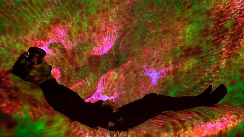
Brain-controlled VR lightshows could lull you to sleep
By most accounts, technology wreaks havoc on our sleep. Even tools meant to help us sleep better can make insomnia worse. But sleep and tech don't have to be mutually exclusive. Artists and researchers from Royal Melbourne Institute of Technology (RMIT) University have created a virtual reality tool to induce sleep. The device, Inter-Dream, combines ambient music controlled by artists with kaleidoscopic visuals controlled by the user's brainwaves, via EEG.
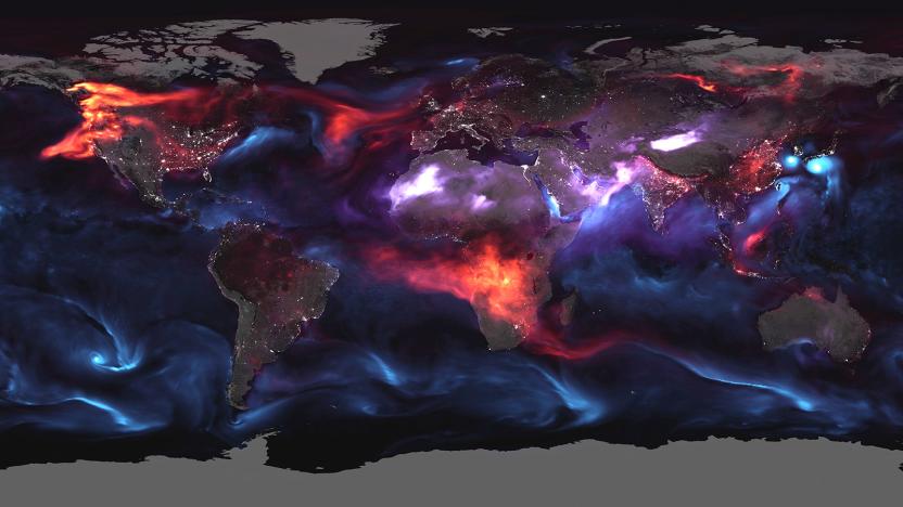
NASA's terrifying visualization of atmospheric aerosols
Heatwaves, hurricanes and other extreme weather might be the "face of climate change," but it's not the only sign. A grim new visualization from NASA shows another problem caused indirectly by global warming: airborne particles and droplets. These "aerosols," shown on a single day on August 23rd, come from dust, volcanic ash and other sources. They're particularly brutal this year because of fires in California, British Columbia and the southern part of Africa.

HoloLens is helping engineers visualize building blueprints
With its ability to give the real world a digital assist, mixed reality can be much more useful than the insular cocoon of VR. Microsoft is showing again how HoloLens can help designers via a collaboration with the University of Cambridge's construction IT lab. "We've never been able to bring 3D models from buildings and bridges off our screens and onto the real structure," says Cambridge's Ionnis Brilakis. Using the HoloLens, however, engineers can overlay a design onto a real world bridge or building (or vice-versa), making inspections simpler and safer.

This is what Kobe's 20-year career in basketball looks like
Information is beautiful, none more so when data is combined with the power of the web to let us visualize the previously unseen. It's one of the reasons why data journalism is so engaging, since it helps show things that you would have otherwise had to trawl through mountains of spreadsheets to understand. This is one such example, the L.A. Times' breakdown of almost every shot Kobe Bryant took during his two-decade tenure with the Los Angeles Lakers. Head on over to the Times' website and you'll be able to delve into the stats, with each type of shot, the game and the distance all included. Oh, except for two shots from the 2012-13 season which got missed by the NBA's shot tracking data. But hey, nobody's perfect.

Watch a worm's brain light up as it plots its next move
Scientists have created the first ever video of neurons firing in a freely moving animal, a technique that could lead to greater understanding about how our own brains work. The Princeton-led team first programmed a nematode worm's neurons to create a fluorescent protein that lit up in response to calcium. Since calcium is generally present when a neuron fires, that means they could literally visualize the 1 millimeter-long worm "thinking" as it wriggles around. The resulting video (below) shows 77 of the nematode's 302 neurons working in the top panel, while the bottom panel simultaneously shows its activities and brain position.

Watch this: Human transforms its app data into striking activity maps
The folks behind Human know a thing or two about aesthetics, having crafted an activity-tracking app for iOS that's quite lovely. The mobile software keeps tabs on walking, running, biking and vehicular motion with goal of racking up at least 30 minutes of physical activity per day. Now, the outfit has taken user data from 30 of the largest cities in the world and constructed visualizations for each locale. Maps for all three of the aforementioned endeavors are included, broken down by activity for further analysis. Don't take our word for it though, watch the cartographic motion take place for yourself after the break.

Visualized: global DDoS attacks animated and mapped by Google
Earlier today, Google announced it had built Project Shield to help small websites stay online during DDoS (distributed denial of service) strikes, and it turns out the search giant also unveiled a frequently-updated online map of such assaults. Dubbed Digital Attack Map, the project was created in partnership with Arbor Networks, which updates the site every hour with anonymous DDoS events from over 270 internet service providers it counts as customers. Animations of inbound, outbound and internal volleys from countries across the globe fill the map, and are accompanied by data regarding duration, bandwidth and more. However, only a partial picture of the situation is painted, and the source of incursions can be incorrect. Not only does the effort rely on an incomplete data set -- though Mountain View argues this is the most fleshed out around -- but the origin of DDoS attacks are often forged, and are sometimes unwilling computers directed by foreign-controlled botnets. This affair is far from scientific, but feel free to play security researcher for a day at the source.

Nokia Here research brings map data to life (video)
Nokia Here collection vehicles aren't the only way the Finnish giant is gathering data about our highways and city streets. The company's researchers are also using anonymous smartphone, PND and even CAN bus data to further our understanding of traffic flow and driver behavior in different conditions. Beyond improving maps and navigation, the goal is to make our roads better and cars smarter. We recently spoke with Nokia's Jane Macfarlane, Head of Research for Here, who shared how her team is bringing map data to life with the collaboration of opt-in smartphone users and fleet vehicle operators. Take a look at our gallery below and watch the video after the break.

Bubble Browser for Evernote shows tags as bubbles
Bubble Browser, now available on the Mac App Store, is a new tool to assist in visualizing Evernote data. In particular, it excels at showing you tagged info, and presents larger bubbles corresponding to the frequency of use for a given tag. It's fast and easy to use, and I had a lot of fun poking around my "other brain" to see what I had been storing and what I hadn't tagged. Bubble Browser can also search and sort by notebook, dates and titles, so besides the bubbles, you have a nifty sorting tool. While all of this may seem superfluous, the intent is to help spark connections between sets of data, and to help you see what you are spending time tagging or storing. The app is currently free, so give it a try and see how good data mining can look.

Vizify offers free infographics all about you, makes you feel like a big shot
Infographics. The stuff of high turnover websites and news channels, right? Well, yes, but now you can bring the same white space and pastel shades to your own internet footprint, courtesy of free infographic web app Vizify. It's still in its trial period for now, which means you'll have to wait for an entry code to tap into the breezy visualization generator, but we managed to plug in as many social networks as we could to see how it all works. The service is definitely centered around those that are very connected to the internet. Vizify will draw information from Facebook, Twitter, FourSquare, LinkedIn and also connect through work-based websites you add yourself. It will then populate a clickable front page with circles including images, quotes and links to your profile elsewhere. The service, which is geared at recruitment, crafts a convenient short link to offer up on resumes or job emails. Edit options include a choice of color palettes, and the ability to tweak the layout of the information circles [seen above] and the larger pages that follow it, bringing either more career-centric (or interesting) content to the forefront. Sign up for an access code at the source to give it a try for yourself, or take a stalker-esque trip down an Engadget editor's social network tracks at the second link below.

Pixar Image Computer: Yours on eBay for a cool $25K
So, you purchased a mint condition Apple I at an auction, have every model of Mac Quadra and Performa ever made, use your NeXT cube every day, love your working Newton MessagePad and QuickTake 100, and you're looking for something Apple-related that will finish off the collection. How about an ultra-rare Pixar Image Computer? There's one selling on eBay with a starting bid price of US$15,000 and a BuyItNow price of $25,000, and at the time of publication there were still no bids. This is a very unique piece of equipment tied to Steve Jobs and Apple. The Pixar Image Computer was originally developed by the Computer Division of Lucasfilm. When Steve Jobs purchased that division in 1986, the Pixar Image Computer was made commercially available. At the time, you would have paid $135,000 for the privilege of owning this piece of gear. It was aimed the medical, geophysical, and meteorological visualization markets, and was never meant to be a consumer device. The seller says that he's unsure if it's in working condition as he doesn't have a power cord with which to power it up, but he was able to turn on the monitor. Get your bid in now, as the auction ends on July 26 at 4:42 PM PDT. [via Cult Of Mac] #next_pages_container { width: 5px; hight: 5px; position: absolute; top: -100px; left: -100px; z-index: 2147483647 !important; }

Visualized: Second-gen Samsung Series 9 gets torn down to its ultra-slim components
Chances are you're no stranger to the Samsung Series 9 -- the first generation stood out for its slimness, and the most current version is an impressive 28 percent thinner. If you're wondering how those notebooks can be so dang skinny, your curiosity will be satisfied by Samsung's teardown of a 13-inch model. A thinner LCD and a customized main board contribute to the machine's slight profile, as do a 40 percent slimmer touchpad and a built-in lithium-polymer battery. As is so often the case, the pictures speak much louder than words, so hop over to Samsung's blog for a gander.

techBASIC 2.0 brings sensor data collection, analysis and visualization to iOS
Scientists and hobbyists who want to use their iOS devices as tricorders now have a new tool to help them to bring that dream to life. Byte Works has released version 2.0 of techBASIC, a US$14.99 scientific and educational programming environment for iOS that can be used to pull in data from internal (accelerometer, magnetometer, and gyroscope) and external sensors. In case the name Byte Works sounds familiar to some of you, the company has been around for a long time. Mike and Patty Westerfield started the company in the early 1980s, developing the ORCA computer languages for the 8-bit Apple II. ORCA/M became the standard development system for the Apple IIGS under the names Cortland Programmer's Workshop (CPW) and Apple Programmer's Workshop (APW). techBASIC has its roots in another Byte Works product, GSoft Basic for the Apple IIGS. techBASIC 2.0 is a universal app, so any program you develop on your iPhone can easily be run on your iPad or vice-versa. Launching the app on the iPhone displays a list of included example programs -- the source code for these programs is a nice place to pick up some tips on how to access and use readings from the sensors built into iOS devices. The iPad version shows the list of programs and also provides a window showing the graphical output of your programming efforts. %Gallery-153474% Of course, you cannot create apps for sale in the app store with techBASIC. However, you can send your code to others through email. I'd personally like to see techBASIC work with Dropbox or iCloud for storing self-created apps online for backup and sharing. A tap on any one of the program names displays its source code. The example programs are not only useful, but well-commented for educational purposes. In both the iPhone and iPad flavors, techBASIC includes buttons to display the source code, show a console, see graphics being generated by your program, etc... If you need to, it's possible to step through a program to see how it works or to debug an issue. The documentation for techBASIC is available online, consisting of a reference manual and individual Quick Start guides for iPhone and iPad. There's also a built-in help system with full details of statements, functions, events, graphics classes, GUI classes, sensor classes, and system classes. Perhaps one of the coolest features of techBASIC 2.0 is the ability to tap into the sensors of your favorite iOS devices. The language provides a way to tap into the accelerometer, magnetometer, and gyroscope, and also to grab your current latitude-longitude, altitude, and more. There's a separate sensor class for the HiJack hardware, a University of Michigan project to add small sensor packages to iOS devices. The techBASIC blog features an example app showing how to grab readings from a HiJack-connected potentiometer. The potential here is huge -- imagine being able to connect HiJack to a thermocouple to grab a temperature log through techBASIC, or to an anemometer to measure and track wind velocity on an iPad or iPhone. One of the reviewers listed on the Byte Works website notes that she feels that techBASIC is a "mini-MATLAB in my pocket." I have to agree. While techBASIC isn't nearly as high-powered as MATLAB, it's more amenable and affordable to those who want a lot of the same capabilities to analyze and visualize data. I won't go into a huge, detailed description of the techBASIC language here, since the documentation is readily available. But I will say that this is an excellent development environment for researchers or anyone with an iOS device who enjoys tinkering with hardware. For students, techBASIC is an inexpensive way to learn about programming. Be sure to check out the gallery to see screenshots from both the iPhone and iPad, and watch the video below for a look at techBASIC in action.

Kickstarter hits a million backers, impoverished design students rejoice
Despite these shaky economic times, people still have the time -- and money -- for modded Arduino kits, iPhone lens and air guitar mods. Kickstarter users have now pledged over $100 million to projects, with the number of backers leaping from around 250,000 in September last year to over one million. The crowd-funding site is marking the occasion with visualizations of its vital statistics, showing, among other things, that one-time backers make up the bulk of investment. With over 13,000 projects green-lighted so far, projects still vying for our investment dollars include a caterpillar-tracked smartphone robot, a bike light that attaches to your spokes generating an 8-bit light show and an energy recovery unit that picks up on heat from a dryer exhaust. If the idea of heat exchanges gets you all hot under the collar, check out Kickstarter to help give the creators a fiscal foothold.

Google Maps adds 3D bird's eye route previews for high-flying navigators
Sure, you could use Google Maps to find the shortest path from point A to point B, but what if you're interested in going from A to B via scenic route C? That's where Google's new 'helicopter view' comes in. Unveiled last week, this feature allows online navigators to visualize any driving, walking or mass transit route with a 3D, bird's-eye animation. All you have to do is enter your starting point, destination and mode of transportation, and click the new "3D" button that will appear next to each route. From there, you'll be launched into a Google Earth-powered flight, displaying all the buildings, mountains and other terrain that you'd encounter during your real-life journey. You can also pause the flight at any moment to check out any sights of interest, along with any geo-linked photos, videos or other online content. Buckle up and check out the source link below for more details and images.

The Deleted City visualizes GeoCities as it was, today
GeoCities may be no more, but, unlike some other bits of internet past, its entire contents were thoroughly archived before the site was completely shut down in 2009. That opened up some interesting possibilities for anyone interested in playing around with the 650 gigabyte archive, and this so-called "Deleted City" project may well be the most interesting yet. Described as a "digital archaeology of the world wide web as it exploded into the 21st century," the project appropriately visualized GeoCities as one large city, which can be dived into and explored at will (complete with a soundtrack supplied by "nearby" MIDI files). Unfortunately, it's not clear when or if folks will actually be able to try it out for themselves, but you can at least take a guided tour in the video after the break.

Crowdflow tracks 880 iPhones across Europe, wants to put you on the map
Do you have dreams of becoming a digital firefly, flitting back and forth across Europe? The folks at Crowdflow can help with that -- all you need to do is use your iPhone, and adopt a share-alike attitude. Using location data collected from 880 iPhones, the team has created a video showing iPhone movement through Europe for the month of April, 2011. This glowing digital ballet is just a start, however -- Crowdflow is asking iPhone users to extract and submit their own location logs to help build a visual map of how cellular networks are distributed throughout the world. If you're not afraid of lending your geodata to an open database, hit up the source link for your own chance to join in Crowdflow's eerie cellular glow.

Watch iPhone owners travel around Europe
Over 800 iPhone owners donated their location information to Michael Krell of Crowdflow. He took this data plotted it on a map and set it in motion. It's captivating to watch the firefly-like blips move here and there across the region. Check out the video below. [Via GigaOM]

Visualized: a zettabyte
Remember the good old days when a gigabyte was considered a lot of space? Improvements in hard disk technology have allowed the humble magnetic drive to reach the dizzying heights of multiple terabytes of storage, but Cisco foresees a future that's a few orders of magnitude more impressive. Pinpointing 2015 as the commencement of what it calls the zettabyte era, the company has put together a handy infographic to show us just how much data can be fit into one: you can alternatively think of it as the equivalent of 250 billion DVDs, 36 million years of HD video, or the volume of the Great Wall of China if you allow an 11oz cup of coffee to represent a gigabyte of data. So "zetta" must be Greek for one hell of a lot, but what Cisco expects is that we'll be pushing that much information around the web each year by 2015. Any bets on how many exabytes of it will be to stream videos of cats diving into cardboard boxes?


