map
Latest
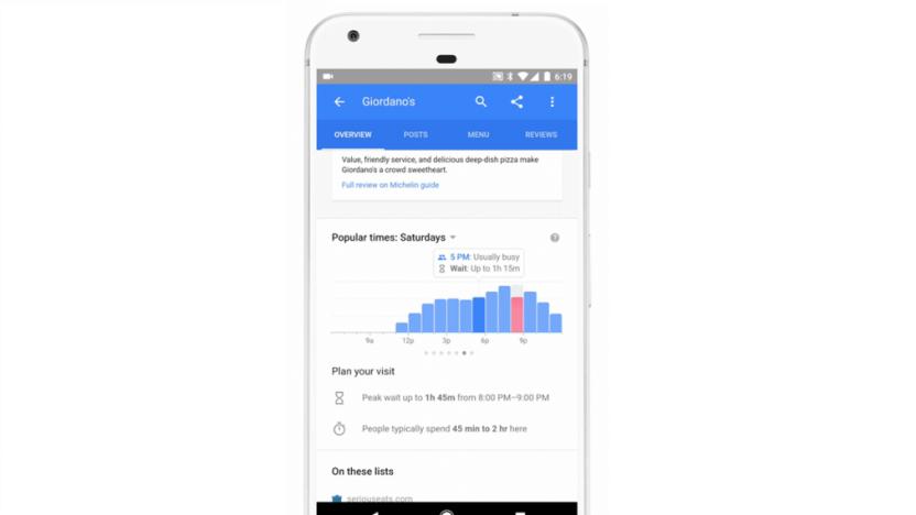
Google shows the waiting times at your favorite restaurants
If weird food trends (cronut, anyone?) have taught us anything it's that people are prepared to wait a long time for a seat at a restaurant, so whether you're visiting a popular local eatery or Time Out's latest gastro-pick, you're faced with two choices. Attempt to beat the crowds by having dinner at 4pm, or rock up whenever and hope the people in the line ahead give up before you do. Now though, in a development we can't believe didn't happen sooner, Google will show you the wait times of nearly a million sit-down restaurants around the world.

Blizzard shows off broadcast-friendly 'Overwatch' features
Last week Overwatch game director Jeff Kaplan explained some of the tweaks Blizzard planned to make this game easier to follow for viewers, and now a new video actually shows them off. As Blizzard prepares to launch its professional Overwatch League next year (and presents Overwatch World Cup matches over the next couple of days), it's going all-in to make the game TV-friendly, even for people who aren't yet die-hard eSports fans.
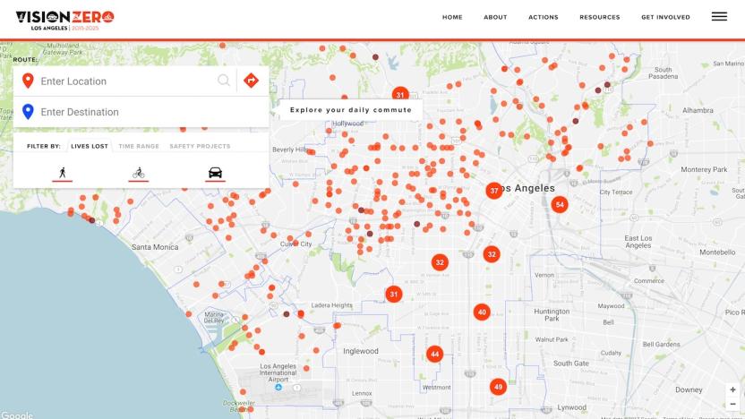
LA fights soaring pedestrian deaths with an interactive map
Open data can be an incredibly powerful tool, but it still requires context and people to actually pay attention to the information for it to be valuable. Los Angeles has discovered this the hard way. Its Vision Zero initiative aims to eliminate traffic deaths by 2025, but compared to other cities with similar programs, LA is coming up short in terms of results. After the program's first full year (2016), fatalities rose by some 43 percent according to the Los Angeles Times. There are a number of reasons for this, including more pedestrian and bicycle traffic, distracted driving and driving under the influence. To combat the rising number, the city looked to data as a means of discerning the most fatal roadways.

Detailed 3D ocean map can help with marine conservation
We've explored such a small part of the ocean that we know more about the moon and Mars. This new three-dimensional map can help us get more acquainted with the body of water that occupies most of our planet, though. It sorts water masses around the world into 37 categories of different temperatures, salinity, oxygen and nutrient levels. There are other maps out there, but they mostly focus on surface or coastal ecosystems. This project, which is officially called ecological marine units (EMUs), includes the waters between the surface and the ocean floor. It maps the frigid waters of the deep sea, the oxygen-deprived Black Sea, the Red Sea and even some rivers in the Northern Hemisphere.

Here Maps is expanding to China with the help of new investors
Here, the mapping company owned by German automakers Audi, BMW and Daimler, plans to bring its products and services to China. To make that happen, it has enlisted the help of three new Asian investors: Chinese internet giant Tencent, digital map provider NavInfo and Singaporean investment firm GIC. They're acquiring a 10 percent stake in Here together, and they're tweaking the company's products to make them ready for the Chinese market.

Facebook launches interactive map for Live Video
Facebook's Live Video feature just got global thanks to an interactive map that's rolling out on the site. If you're looking for a stream from a random stranger you can either choose one from one of the highly ranked clips on the left side of the page, or click on one of the blue dots from everyone else on the digital globe.
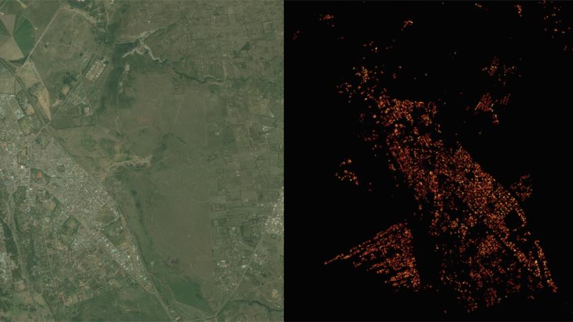
Facebook created a super-detailed population density map
Facebook's quest to get the world online is paying some unexpected dividends. Its Connectivity Lab is using image recognition technology to create population density maps that are much more accurate (to within 10m) than previous data sets -- where earlier examples are little more than blobs, Facebook shows even the finer aspects of individual neighborhoods. The trick was to modify the internet giant's existing neural network so that it could quickly determine whether or not buildings are present in satellite images. Instead of spending ages mapping every last corner of the globe, Facebook only had to train its network on 8,000 images and set it loose.
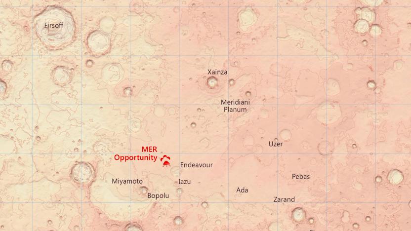
Detailed Mars maps help you plan the hike of your dreams
With the help of NASA's Curiosity rover, we've seen a lot more of Mars than we ever anticipated -- especially the Red Planet's sand dunes. But the exact topography of the planet remains a mystery to anyone not carefully studying the space agency's data. Britain's Ordnance Survey (OS) agency wants to change that, so it used its mapping expertise to create new charts detailing Mars' terrain.

Gamma ray map offers best view yet of our galaxy's energy
Space is full of gamma rays and other intense forms of energy, but you've only ever had a partial picture of it. Ground-based telescopes can only see so much, and even the Fermi space telescope (designed to catch these energies) has missed out on a lot of it... until now, that is. NASA has posted a much more complete gamma ray map using 6 years' worth of refined Fermi data. The result is a far more detailed and comprehensive view of the energy 'bright spots' (between 50 billion to 2 trillion electron volts) in the Milky Way galaxy and beyond. The pretty picture you see above includes the leftovers of supernovae, pulsar wind nebulae and even galaxies whose supermassive black holes make them detectable from millions of light years away.

Google Map Maker returns to the US, UK and over 40 other countries
Google's Map Maker tool returned a few weeks ago after being shut down following an issue with digital vandalism. While it went live in six countries earlier this month, the US and UK weren't among the selected locales for the initial return. Map Maker is available in those areas once again, though, as well as over 40 other countries to bring the total tally to more than 50. As part of the re-opening, Google has "regional leads" in each country to keep an eye on things, looking to keep any would-be vandals at bay. To find out if Map Maker is available where you are, head over to the site and input your location.

Explore the world's economy in Harvard's trippy 3D map
Wrapping your head around the planet's economic activity isn't easy, even if you study economics for a living. However, Harvard's Owen Cornec (he of WikiGalaxy fame) believes he can help. He built the Globe of Economic Complexity, a web-based map that lets you explore Earth's economic relationships through 3D "confetti." It looks more than a little psychedelic, but it's incredibly detailed. You'll not only see the range of exports in a given country, but their volumes, their destinations and the intricate connections between products. Frankly, it could be helpful even if you're outside of academia -- it can provide important context for news stories and otherwise explain machinations that would normally remain confusing.

Fan-made 'GTA V' interactive map app puts Rockstar's to shame
Grand Theft Auto V really seems like the gift that keeps on giving. The latest present? An unofficial map app (Android, iOS and web) that's been updated with collectibles locations from the current-gen releases like Peyote plants that let you play as sharks, eagles and more -- yes, flying around as a bird of prey is bizarre as it sounds. The differences between this and the official app are pretty major, too. As VG24/7 reports, you can add personal notes to the map, track your collectibles progress and even switch between atlas and satellite views of the terrain. Future plans include making streets searchable by name. Interested? Hit the source links below to grab it for your device of choice.

The human cost of global spyware sales
This year a number of major news stories released information on world governments buying, selling and using surveillance technologies on their citizens. These stories, reports -- and in some cases, hacktivist breaches and data dumps -- have served to verify the acquisition and use of spyware on citizens by dozens of diverse governments around the globe. We sought to answer one question: Why is this a problem, exactly?

Spotify map compiles playlists from musical tastes around the world
If you're curious what kind of music folks in other parts of the world are listening to, Spotify now offers a handy tool that compiles just that. The streaming service gathers info from popular tracks around the globe and compiles them into playlists. Rather than list them in a boring in-app search, it plots them out on an interactive map for quick visual reference. This means that when you click on Durham, North Carolina, for example, you'll be greeted with a collection of tracks the folks there are listening to on the regular. Mandolin Orange and Future are quite popular in that part of NC, in case you were wondering. As you might expect, once you queue up a playlist in the app, you can add any notable findings to your personal collection for future use. Spotify says it updates the lists about twice a month, and each time it does, it sorts through 20 billion listener and song relationships.

NASA's Mars Trek is Google Earth for the red planet
Yes, Google Earth and Street View are great for impromptu armchair traveling. But if you prefer taking a virtual jaunt somewhere literally out of this world, you might want to visit NASA's Mars Trek website instead. It's exactly what its name makes it sound like: an interactive map of the red planet's surface made out of images taken by several missions, which you can explore in either 2D or 3D. You won't see close-up views of its craters and volcanoes, of course, but it does allow you to zoom in and change views (global, north polar and south polar).

Mapping project catalogs Instagram sunrises from around the world
Have you noticed the wealth of sunrise and sunset photos on Instagram? Michelle Chandra certainly has, and her project offers a look at the sun's activity around the world in real time. "All Our Suns" gathers snapshots upload with either the #sunrise or #sunset hashtag, using the posts to populate a set of data-driven maps. Two of the crowdsourced cartography pieces catalog every image that's uploaded during the course of a 24-hour period -- one for sunrises and one for sunsets based on a user's location. What's more, you can click on a location marker to view the photo. A third map notes times when two people are posting at the same time, with one updating the beginning and the other observing the end of a day. The whole thing is a study on how our lives literally revolve around the sun and how social networks illustrate time as a never-ending loop.

Follow the world's mass transit on this live map
Sure, it's not hard to learn when your bus is likely to show up, but have you wondered where everyone else's bus is at any given moment? You now have an easy way to find out. GeOps and the University of Freiburg have rolled out TRAVIC (Transit Visualization Client), a map that shows the real-time positions of buses and trains from more than 200 public transportation systems around the globe. Some of this info is based on schedule estimates, but it's still quite hypnotic -- you can see when subway cars pass by Times Square (hint: often), or how long it takes a bus to arrive at Barcelona's beach. While this tool probably won't be very useful for planning your own trips, it'll definitely remind you just how much effort goes into getting you across the urban landscape.

It's now possible to map your home's WiFi signal in 3D
We already know that it's possible to map your home's WiFi signal in 2D, but that doesn't help if you're holding your phone above your head to get connected. Step forward YouTuber CNLohr, who appears to have developed a reasonably low-tech way to analyze the WiFi strength of any 3D space. Using just a WiFi module and a CNC mill, he was able to detect the variability of the signal in an area and then create the funky visualization you see before you.

WiFi Map uses community power to share network passwords
WiFi Map is a crowdsourced tool for finding all of the Wi-Fi hotspots in your area as well as the passwords to certain security-protected networks. Anyone in the area is able to comment on a WiFi network and leave the password for others to use, plus WiFi Map lets you save these in a collection so you never forget them. Contribute to the community too by adding Wi-Fi networks you're connected to that aren't publicly listed. The app is free for iOS, though there is a Pro version that sells for US$4.99. Both require iOS 7.0 or later. The days of unlimited data plans are just about over. Instead, we all have to face the reality of data caps. A solid Wi-Fi connection helps soothe that pain though, since none of your data usage over Wi-Fi counts toward your carrier usage. As an added bonus, Wi-Fi is typically faster than cellular networks, though the gap between the two continues to shrink. Finding a hotspot isn't always so easy though. WiFi Map intelligently lists all of the Wi-Fi networks in your area by distance from your current location. These networks include public or private. Public networks, like say Wi-Fi at a McDonald's, are more clearly labeled and often don't require a password. Private ones are only added by someone connected to that network, so fear not: your privacy should not be in danger. However, being that WiFi Map is crowdsourced, many of the listed networks are user submitted. These appear as a custom name determined by the user often include comments revealing the password if needed. There's no verification system so whether the password is true or not depends on the reliability of the commenter, but it does no harm to try them. WiFi Map also conveniently tells you the address of the location nearby, so if you desperately need a connection you know exactly where to find one. Although, don't let yourself get too desperate because the app itself requires some sort of Internet connection to pull up the list of networks. The pro version, which is a separate app for $4.99, allows for saving of your favorite network names and passwords to access offline. It also lists full details of networks beyond a one mile radius unlike its free counterpart. Of course, WiFi Map wouldn't be complete without a map. It acts just like any other one on iOS - markers scattered around your area to pinpoint the locations of Wi-Fi networks. If you live in an urban area, chances are it's harder to efficiently navigate using the map because there are so many Wi-Fi networks that the map is just cluttered when zoomed out. Using the map alone might work better in suburban areas. The app also has a handy search feature for finding Wi-Fi based on the type of venue giving out a signal - arguably the best feature to quickly check if your destination can grant you temporary relief from the physical and emotional pain that result from a glance at your phone bill. WiFi Map is undoubtedly practical for travelers and in general a nice tool for just about anyone to have, especially those with low-end data plans. The $4.99 price point of the pro version is a bit too steep, but I suspect the free version offers enough for the average user anyway. Both WiFi Map and WiFi Map Pro are available universally for iOS.

Collaborative mapping project will chart the Amazon's rivers
Crowdsourced mapping efforts are helpful in many places, but they're most useful in corners of the globe where even the professional maps are incomplete -- you can address gaps in coverage that might be difficult for distant observers to fill. And OpenStreetMap knows it. The community-driven site has just launched Mapazonia, a project that asks you to help chart the Amazon's rivers and roads. It's not expecting comprehensive data when the area spans 2.1 million square miles, but it believes that your first-hand knowledge could put missing towns on the map and fix inaccuracies in the shoreline.


