material design
Latest

Google's sign-in and sign-up pages have a new look
After teasing it for the past couple of weeks, Google is rolling out a new sign-in page with a slightly cleaner design.

Google will stop trying to make its iOS apps look like Android apps
Google says it will phase out its use of Material Design interface elements within its iOS apps in favor of Apple’s own UIKit.
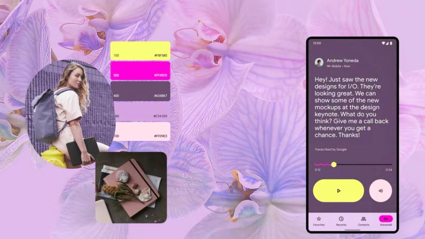
Material You is a colorful, personalized redesign for Android and more
Google just started talking about Android 12 at the Google I/O developer event, and Matias Duarte just introduced a new way to personalize its products called Material You (a riff on Material Design, which Duarte introduced for Android back in 2014).
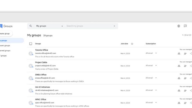
Google Groups still exists and it's getting a redesign
Google has famously killed off a number of social network and messaging services over the last couple of decades (remember Allo? Or Google Talk?). But, amazingly, the Usenet-linked Google Groups setup that's been operational since 2001 is still cranking along. It hasn't had a UI update to match the company's other tools in years though, and a Material-design makeover is incoming. The filtering and search will also be revamped, and they claim it will be easier than ever to start a new group.

Google Play Newsstand now shows stories based on your interests
If you're a heavy user of Google's news reader, get ready to bear with some big changes: today, the company gave Newsstand a complete overhaul. The updated app takes a step back from the categorically organized feed the app is known for to focus on creating an experience specifically tailored to the interests of the user. The idea is to create a more personal experience that factors in local news, personal interests and the day's major headlines.

Chrome OS gets a new launcher and more Material Design
Early adopters have had access to a redesigned Chrome OS launcher since last month. Now, Google is making that feature available to all users of its web-based operating system. Today's fresh, stable update to Chrome OS also comes packed with a number of Material Design elements, bringing a new look to the Files app and the default typeface. Just as well, there's an updated calculator app, support for password-protected zip files -- plus, of course, the customary bug fixes and security revisions. So expect to see changes the next time you boot up your Chrome OS machine, some visible, others not so much. Either way, rest assured they are for the better, especially the Google Now-equipped Chrome Launcher 2.0.

Google Calendar gets smarter and prettier
As part of the Google's continued push forward with Lollipop, Calendar is getting a major (and long-overdue) upgrade. Obviously that includes a Material Design facelift (which we can only assume will come to the web app eventually), but it also includes a metric ton of new features. The most impressive is its ability to mine your inbox for valuable information and automatically create appointments for you. Rather than suggest an event when you open your flight itinerary in Gmail, the new Google Calendar will just pull in that information -- including your flight number and check-in time. Best of all, those events are automatically updated, say if your flight is delayed or your pottery class is canceled. Assists are an other effort to save you time by suggesting locations, people or even events titles based on your behavior. As an example, Google says if you frequently go running with your friend Peter in Central park, typing "r-u-n" should automatically suggest "Running with Peter in Central Park" complete with a link to the location on the map and contact for Peter.

Google Play Newsstand gets a redesign and new magazine view
Google is working its way through all its apps and updating them in anticipation of the release Android L. Next on the list is Play Newsstand, which most obviously is getting a Material Design facelift. That means a card based UI with bigger images and lots of transitional animations. But a visual revamp on its own isn't particularly exciting. The best news is that the reading experience for print magazines has been revamped. Until now reading a magazine meant scrolling around a PDF version of the print editions, with a few notable exceptions that had "interactive" editions. Now, you'll actually be able to browse a list of articles in the issue and open them up in a format that's much more phone friendly. You get clean easy to read text, without having to sacrifice the big images. Newsstand is also getting much more fine grained control over the topics in the explore section. So instead of just Food & Drink, you can get articles dedicated to vegetarian cuisine or the paleo diet delivered straight to your phone. The new version of Google Play Newsstand will be rolling out on Android over the next week. iOS users will probably have to wait a long while...

Google experimenting with major redesign of Chrome OS
Google has made attempts in the past to unify the design of its various properties with varying degrees of success. Material Design, which is major part of the upcoming Android L release, may be its most coherent effort to date. The new look is expected to touch every corner of Google's catalog, and Chrome OS will be part of that revamp. A screen shot posted by Chromium evangelist François Beaufort on Google+ shows the very early fruits of Athena, an effort to "bring a new kind of user experience" to Mountain View's desktop OS. The image shows windows with minimal controls and decoration in a stacked card view, similar to the app switcher revealed as part of the next Android update. There's also what appears to be a launcher bar with a search field at the bottom of the screen. While the redesign is clearly in the very early stages, you can see the important elements of Material Design at work. Everything is flat and paper like, but exists in a three-dimensional space, complete with less-than-subtle drop shadows. You can compile a copy of Chromium OS yourself to give Athena a test run, but we'd hold out for a more complete version.

Google's new 'Material Design' UI coming to Android, Chrome OS and the web
Google's annual I/O developer keynote has only just begun, but already we're being treated to some of its announcements. In a bid to create a new "visual language" for users, Google is taking the design of its Android, Chrome OS and web properties back to basics with its new "Material Design." According to Google, Material Design is intended to make better use of available space, and bring a consistent user experience whether viewed on a smartphone, tablet or desktop. Google's apps will be updated to reflect this change, as you may have seen in early Gmail and Calendar app leaks and in the latest version of the Google+ app on Android.

Google's next version of Android 'L' release has a new look, deeper ties to the web
KitKat may have only found its way onto roughly 15 percent of phones at this point, but that won't stop Google from looking to the future. The new version, teased by Sundar Pichai is simply being referred to as the "L" release right now. As previous leaks have indicated, this will be the most dramatic UI overhaul the OS has enjoyed since Ice Cream Sandwich debuted back in 2011. The heart of this overhaul is called Material Design -- a flatter look, with rounder elements and softer edges that will extend beyond tablets and phones to Chrome OS and Google's various web services. You can see some of the new design philosophy at work already in the latest version of the Google+ app on Android. But it goes beyond that. Shapes are simplified and there are smooth transition animations across the UI. And those animations aren't just inside apps; they can also be between apps. For instance, you could view an image in the photo gallery, and then choose to open it in a third-party editor. Rather than laboriously closing the gallery and then opening the editor, the image itself could appear to float above the apps and simply shift into the second app, which is already open to the editing pane. Developers can also add the illusion of depth by adding "elevation" which automatically stacks visual elements appropriately and adds drop shadows.


