Peek is a very pretty calendar for iPhone

If Peek Calendar by Square Mountains (US$1.99) were a camera it'd be a Holga. If it were jeans they'd be raw and if the app were a beer, you'd find a blue ribbon on the label.
Peek is so hipster it hurts.
But we're taking about a calendar, not jeans or beer. Calendars are the workhorses of the productivity world. I depend on my calendar, as many of you do. I'm happy to use a pretty one, but when form supersedes function, you've got a problem.
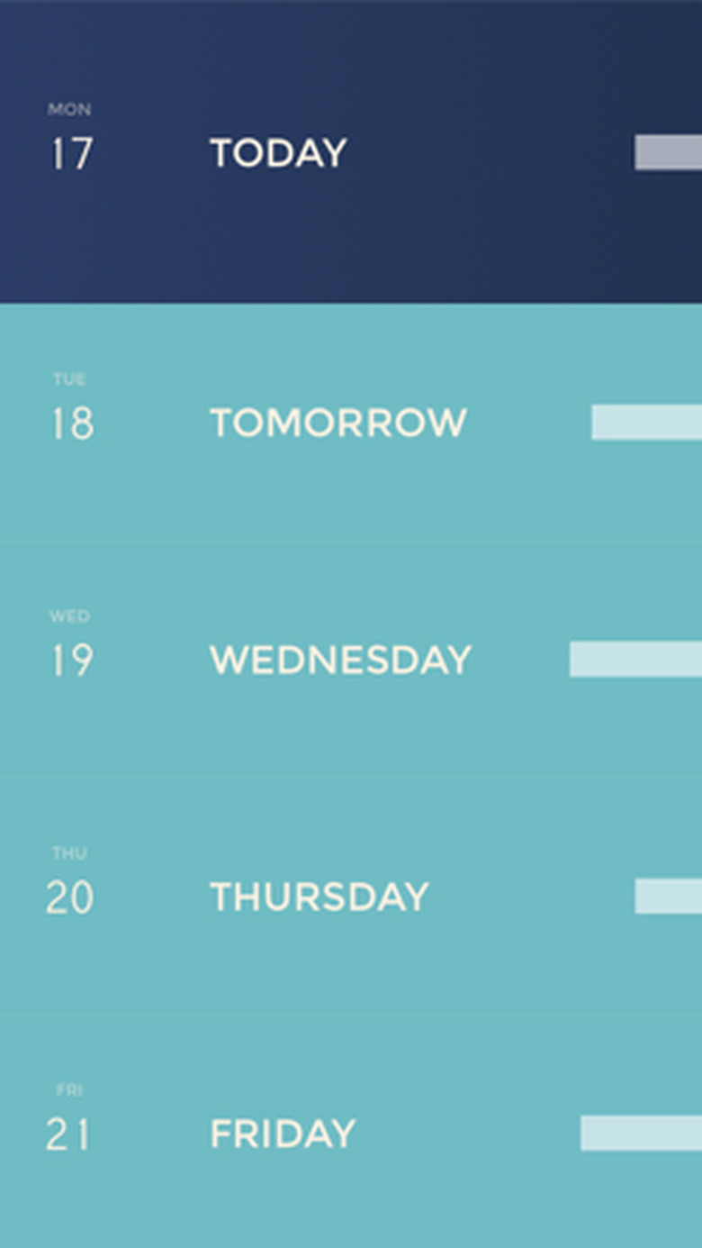
Arguably, Peek's marquee feature is its look. The app uses big, bold colors and three main views: list, month and event specific. To move from week to month view, scroll down. Keep going to move through previous months. Once there, tap any day to review its events. Unfortunately the only way to return to the present day is to scroll back in the opposite direction. It would be nice to tap the top of the screen to jump back.
Week view has its own quirks, including some I really like. The app uses one color for the current day, and another for all the others. Additionally, each quarter, or block of three months, is colored consistently. There's also a sort of "status bar" on the right-hand side of each day. The longer it is, the more you've got scheduled.
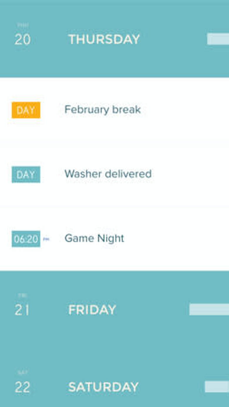
Tap any day and its events "unfold" from beneath it. Day-long events are listed first, then time-specific appointments. Tap any day view specifics, like start and stop time. There's a very nice alarm feature that lets you simply tap one of several clock faces, each displaying a unit of time (5 minutes, 15 minutes, one day and so on). Below that you'll find any location information, repeat options and a list of available calendars (you can assign it to any with a tap).
Another nice feature lets you "peek" at an event's details. Swipe it slightly to the right and its details are revealed from behind it. That's nice too, but Peek leaves me unsatisfied.
As you can see, there's a lot of tapping involved. Compare Peek's default look with that of Fantastical, which I use daily. There's so much more information available at a glance, that typically one look tells me all I need to know. Peek is pretty and bold, but there's so much swiping and tapping to be done before my day is fully revealed.
Many of you will love it, especially those in favor of progressive design. While I think Peek is beautiful, it's less functional than I need a mission-critical app to be.