UX
Latest
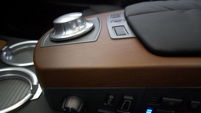
Hitting the Books: BMW's iDrive and the pitfalls of an overly customizable UX
Major and Shah explore the user experience, how companies leverage it to attract and maintain customers, and how allowing users to define their own experiences can lead to disastrous design outcomes.
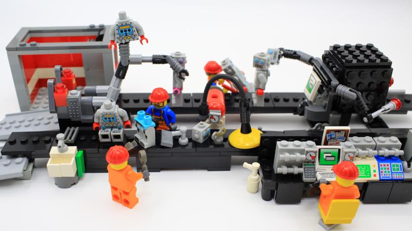
Recommended Reading: The world of Lego interface panel design
The week's noteworthy writing on technology and more.
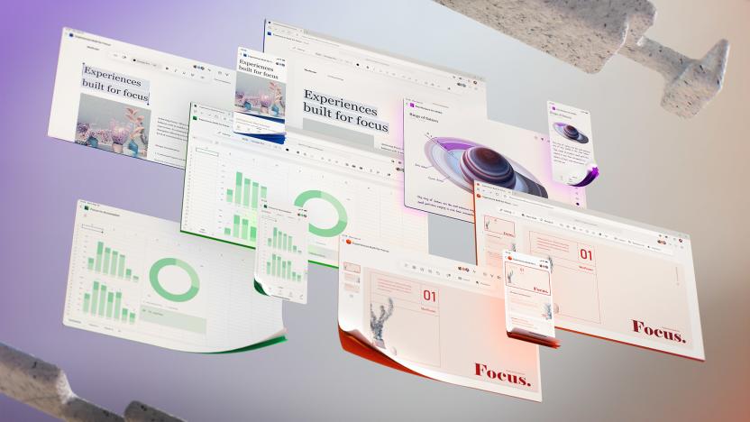
Microsoft details potential new designs for the Office UI
Some might think that Microsoft should pick a user interface for its Office products and stick with it, but its UX designers are having none of that. The company has unveiled yet more potential changes to its Microsoft 365 user interface in an ambitious Medium post.
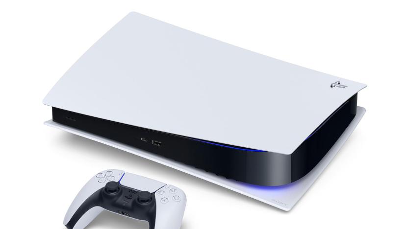
The PS5's dashboard will have ‘a whole new visual language’
The PlayStation 5 was finally unveiled last week and whatever you make of the design, we can probably agree that it’s something of a departure from the console’s previous iterations. Now, PlayStation’s head of UX design has said we can expect the same for its user interface.
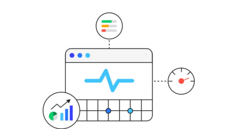
Google’s Web Vitals helps websites put visitors first
Google's new developer tool will help achieve optimal performance for websites.

Samsung update brings Watch Active2 features to earlier Watch models
Thinking about upgrading your Samsung Galaxy Watch to a Galaxy Watch Active2? You might want to hold off for now, as Samsung is rolling out an update that'll bring enhanced features to earlier-generation watches. This means that the Galaxy Watch and Watch Active will get the same user experience functionality found on their successor, the Watch Active2, including new health and Bixby features, as well as boosted customization options.
Google tweaks Hangout Chat app to keep conversations organized
Google has made a couple of changes to the design of the Hangout Chat app to make it easier to keep track of your conversations and stay organized. The previously singular list of People, Rooms and Bots has been split into two tabs: People and Rooms, with Bots included in the People tab. Google has also removed the filter at the top of these tabs to make navigation simpler. Search using the magnifying glass at the top of the screen, or start a chat by tapping + in the bottom right corner. These changes are rolling out on iOS and Android now.
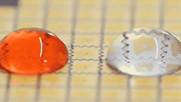
MIT researchers turn water into 'calm' computer interfaces
Our lives are busy and full of distractions. Modern computing. with its constant notifications and enticing red bubbles next to apps, seems designed to keep us enthralled. MIT Media Lab's Tangible Media Group wants to change that by crafting "calm interfaces." The Tangible Media Group demonstrated a way to precisely transport droplets of liquid across a surface back in January, which it called "programmable droplets." The system is essentially just a printed circuit board, coated with a low-friction material, with a grid of copper wiring on top. By programmatically controlling the electric field of the grid, the team is able to change the shape of polarizable liquid droplets and move them around the surface. The precise control is such that droplets can be both merged and split. Moving on from the underlying technology, the team is now focused on showing how we might leverage the system to create, play and communicate through natural materials.
Future phones will ID devices by their electromagnetic fields
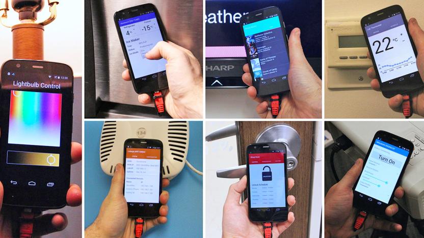
While NFC has become a standard feature on Android phones these days, it is only as convenient as it is available on the other end, not to mention the awkwardness of aligning the antennas as well. As such, Carnegie Mellon University's Future Interfaces Group is proposing a working concept that's practically the next evolution of NFC: electromagnetic emissions sensing. You see, as Disney Research already pointed out last year, each piece of electrical device has its own unique electromagnetic field, so this characteristic alone can be used as an ID so long as the device isn't truly powered off. With a little hardware and software magic, the team has come up with a prototype smartphone -- a modified Moto G from 2013 -- fitted with electromagnetic-sensing capability, so that it can recognize any electronic device by simply tapping on one.
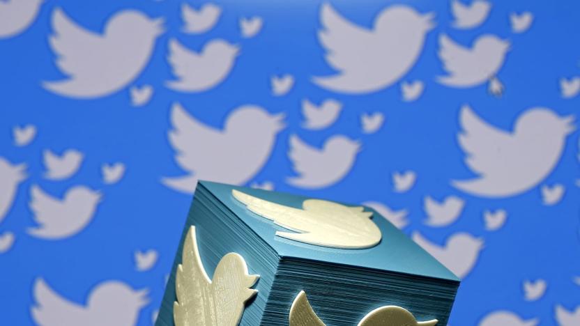
Twitter makes it slightly easier to interact on iOS
There was a time when a Twitter user on iOS had to click from their timeline all the way into a tweet in order to interact with it or its account. Imagine that: Like, two taps of your finger to share it elsewhere or unfollow that person. Ugh! But Twitter's hot on a fix, giving you the ability to interact with one straight from your flow just by clicking a little arrow on the top-right corner of any given tweet. The experience has been righteously streamlined.

TiVo's next-gen interface plays nice with all your TV content
With TiVo's Series 1 DVRs going extinct at the end of the month and new parent company Rovi taking over, the TiVo brand is getting an interface refresh to bring it up to day with people's current viewing habits. (As well as the FCC's proposed set-top box rules.) The next-generation user interface is designed to allow for even better TV content discovery and predictions, a customizable viewing experience and overall less time spent fiddling with the remote.

Sony's designer product series lands in the US, courtesy of MoMA
Sony is bringing its Life Space UX range of well-heeled audio and projector products to the US this May. The company has partnered with the MoMA store to sell its three of its debut devices. The LED Bulb speaker can play your music through Bluetooth (and be a bulb) at $239, followed by more light-and-sound options, the stylish Glass Sound Speaker ($799). This offers higher quality sound than a mere bulb and Sony says the organic glass cylinder vibrates in a similar way to human vocal chords to produce "uniquely lifelike sound" — it'll also run for four hours on batteries alone.

Meet the firm designing futuristic UI for Iron Man and Samsung
Remember Tony Stark's glass smartphone and transparent coffee table in the Iron Man movies? Or how about that gorgeous statue rendering of the Avengers in action at the end of Age of Ultron? You've got one company to thank for those sequences: Perception, a New York City-based visual design firm. It's carved out a unique spot building forward-thinking design concepts for films and major tech companies, including the likes of Samsung, Microsoft and Ford. Perception's work makes it clear we've moved on from the days when interface design was merely an afterthought for movies, and when few tech companies brought cinematic depth and emotion to their products. Now, there's a sort of virtuous cycle of design, where movies lift from tech, and tech companies find inspiration in films.

Pebble nabs the former interface designers for webOS and First Else
Here's some rather unusual news from Pebble: Former webOS designers Itai Vonshak and Liron Damir have left LG to join the wearable startup, which is a pretty big deal given their unique spin on UI design -- you'll want to check out what they did to LG's smart TVs before they left. In fact, if you recall the ill-fated First Else phone from late 2009, its Splay interface -- now available as a standalone launcher (pictured above) on Google Play -- was also the work of the Israeli duo. Vonshak is now in charge of Pebble's Product and UX team, whereas Damir is joining as the Head of Design; and for those who are interested, they're hiring!

Archiving iPhone app workflows
For app developers and bloggers, it's very instructive to have an idea of what has changed in the user interface of an app. App developers can look back and see how both the "look and feel" and steps required to perform a workflow have changed, while bloggers and other writers can use the information to update books or write posts about upgrades. Fortunately for both parties, there's a website called UX Archive run by two French developers (one of whom has moved to the Bay Area) and an American that plans to be an online museum of sorts, exhibiting the changes in app user interfaces and workflows over time. The site neatly divides the screenshots by app and task, so you can narrow down a search to just one particular task -- like creating, deleting, recording, sharing or uploading -- in one specific app. While there aren't a tremendous number of apps and versions currently archived (I counted 60 apps, with only a few showing the changes between iOS 6 and iOS 7 versions of those apps), it's a good start and UX Archive will be a helpful tool in the future provided the curators keep up with the updates. If you sign up for a free email list, UX Archive will ping you when a new workflow is added to the site.

UIU Android launcher targets non-techie users with easy cloud management (video)
Emblaze Mobile's First Else may be no more, but its legacy lives on. During MWC we caught up with the company's ex-CEO, Amir Kupervas, who started a company called UIU in June 2011 -- only a month after his departure and almost a year after the tantalizing First Else got canned. Over at UIU, Kupervas and UX strategist Itay Levin (who also took part in the First Else project) have a more humble ambition: to offer an Android launcher and an accompanying cloud management platform that are simple enough for non-techie users. "In the US, smartphones generate twice as much the amount of calls to the customer centers than the featurephones," said Kupervas. "There's a lot of hustle and a lot of confusion on how to work these guys. People are struggling with them, even existing users."

I've got you under my skin: Huawei to cover Android in new Emotion UI
In the animal kingdom, reptiles shed their skins. In the mobile marketplace, Android smartphones do just the opposite. So, in keeping with the natural order, Huawei's preparing a June coming out party for a UX of its very own, dubbed Emotion UI. The Chinese manufacturer's no stranger to custom interfaces, as we saw at CES 2012 with the optional 3D launcher it employed on the Ascend P line. But as the company continues its trek towards major mobile player status, certain stock perks were sure to fall by the wayside. It's a bid for differentiation that should arguably "enhance" the user experience, but if forums and comment sections are to be believed, this great leap forward is actually a devolution of the worst kind. Hit up the source below to gander at the garbled word constructions of good 'ol Google translate.

Kanzi: ZTE's 3D UX for ICS handsets
To skin or not to skin? That's hardly ever a question for Android OEMs. And, in the case of some Chinese manufacturers, that mark of software differentiation comes in the form of three dimensions. We've already seen Huawei trot out its (optional) 3D UX for the Ascend P line, and now it appears ZTE's ready to follow suit with a custom interface powered by Rightware. The Kanzi UI, as it's called, will come pre-loaded on all of the company's smartphones currently shipping with Ice Cream Sandwich, treating users to a 3D homescreen experience and giving developers a unified platform to port their designs. It's good news if you're a fan of that overlaid visual gimmickry, but we much prefer our Google desserts vanilla and without any toppings. Hit up the break to check out the official presser.

Leap Motion reveals super-accurate motion control tech, $70 device to change the UI game
In many respects, Microsoft has led the charge towards a future of gesture-based controls with its Kinect, and other tech giants like Samsung and Apple are getting in on the action, too. The move to motion controls isn't limited to the big boys, however. Leap Motion has created a new device, called the Leap, it claims is 200 times more accurate than existing technology and will take gesture controls to the next level. It's about the size of a pack of gum, and once connected to your computer via USB, it creates a eight-cubic-foot virtual workspace. Within that area, it tracks all ten of your fingers simultaneously to within 1/100 of a millimeter -- that level of accuracy allows for rudimentary gestures like pinch-to-zoom and more complex actions like manipulating 3D-rendered objects. Naturally, the company isn't telling much about the black magic making it happen, but Leap Motion claims that its software can be embedded in almost anything with an onboard computer, from phones to refrigerators. Users can customize it to suit their needs with custom gestures and sensitivity settings, in addition to chaining multiple Leap devices together to create a larger workspace. Plus, Leap Motion has created an SDK for devs to create Leap-compatible applications and an app discovery platform to distribute them to others. That means the Leap can work in a variety of use cases, from simply navigating your desktop to gaming and computer-aided design. The best part? Leap brings you this next-gen UX for a mere $69.99, and a select few can pre-order them now, with the full roll-out coming this winter. Full details follow in the PR below, and you can see the Leap in action in the videos after the break.

Why Siri is like skeuomorphic UIs: the magic is just skin deep
By now you've probably heard of the widely reported case of Siri's alleged pro-life stance. Walking the dogs this morning, I thought through what I hoped would be an interesting blog post about what I feel this means about Apple and our relationship to technology. I see an interesting link here between Siri and the heavy-on-the-texture UIs of Apple apps like iCal and Find My Friends. Even before the response from Apple was published, it seemed more likely to me that this wasn't so much a case of Apple pushing a political agenda as it was a limitation of Siri making it look that way. Indeed, if anything Apple seems to have a a liberal, rather than conservative, political agenda -- for example, it donated $100,000 to the campaign to keep gay marriage legal in California in 2010. But, really, all this is incidental to what I was thinking of writing. Then Adam Engst wrote a great post at TidBITS that stole my thunder by pre-empting most of what I had to say! The gist of his argument is as follows: that the problem with Siri is that, although it looks very much like sorcery at first glance (and although Apple carefully presents it that way in its advertising), it really isn't. It's just another computer program like all the rest -- and like all the rest it comes with limitations and drawbacks and bugs and issues. It doesn't help that the chattery nature of Siri -- the jokey responses, the easter eggs, the sly film references -- create a substantial facade that it really is a facsimile of a real person. But that's all it is: a facade. Sometimes that facade cracks. For example, we've seen problems because of cloud failures -- or, indeed, if you have no data signal on your phone to communicate with the Siri data centre then it simply stops working. In the case of the searches for abortion-related matters, the problem appears to simply be a lack of information in the backing databases that Siri draws upon, like Yelp and Wolfram Alpha. I'm sure that this is only one of many such gaps in Siri's knowledge, albeit a highly politically charged one. For example, Siri's address lookups are resolutely US only, despite it being supported in many other countries (such as my native UK) and Yelp having a perfectly reasonable database for it to use. Where I'd like to go further than Engst does is by drawing comparisons between Siri and Apple's recent trend towards so-called "skeuomorphic" UIs. This is the extensive use of real-world textures and imagery to underpin an app's functionality. Think of iCal on Lion, Calendar on the iPad, Game Center on iOS, or Find My Friends on the iPhone -- with leather bits, and little torn edges, and faux piles of poker chips, and stacks of pages in the corner of the screen. I have a vehement aesthetic objection to the look-and-feel of most of these apps; I find them pointless, distracting and, frankly, a bit twee. This is merely my own tastes, though. Thinking more objectively I also have a practical objection. I believe that skeuomorphic UIs create false models of interaction. For example, in iBooks there is a stack of pages on the corner of the screen; a swipe across that stack turns the page. Seems logical enough, right? But the same stack of pages in Calendar for iPad on iOS 4 was not swipeable. It looked the same -- and clearly a real-world stack of pages can be turned -- but Apple seemingly just missed this feature out. You might think that it's no big deal for Apple to implement that, and indeed the feature turned up in iOS 5 -- but I would humbly suggest that this is a hole with no bottom. The same stack-of-pages decoration still isn't swipeable in Contacts, for example. Look at iCal for Lion -- look at those little torn edges across the top of the page, where the virtual remains of last months page are seemingly left behind. Why can't I tear them off with my mouse and clean them up? That's exactly what I'd do with a real calendar that looked like that. And even if Apple somehow made a UI that has almost every interaction a reasonable human being might expect of it -- a tall order, but let's suppose -- it's still only going to feel like a sheet of glass. As Bret Victor's fantastic essay on interaction design brillianty demonstrates, "pictures under glass" are never going to be anything more. If you can't smell the leather, or feel the grain, why make it look like leather in the first place? Getting back to my original point, I see a link here. Skeuomorphic UIs resemble physical objects, but they cannot hope to emulate the myriad ways we have to emulate physical objects -- so they are always doomed to disappoint on some level if we let ourselves be fooled. Siri presents itself as a real person, a sort of "auditory skeuomorphism" if you will. But short of passing a Turing test one day that, too, is doomed to always disappoint. Sure, it looks like magic -- but so did the Wizard of Oz until Toto pulled back the curtain. Never forget that there's wires and gears back there making it work, or you'll be surprised when the abstractions leak. Footnote: let's look again at Apple spokesperson Natalie Kerris's statement to the New York Times. She said "[t]hese are not intentional omissions meant to offend anyone. It simply means that as we bring Siri from beta to a final product, we find places where we can do better, and we will in the coming weeks." I think it is interesting for two reasons. Firstly, I'm rather cynical about Siri's "beta" nature; I agree with Macworld senior contributor Glenn Fleishman, who wrote, "If you're advertising Siri as a feature, it's not beta." On iPhone 4S launch day, I spent ten minutes in an Apple Store enduring a low impact sales pitch from a Genius and he didn't mention the "beta" word once. Nor does it appear in Apple's TV spot. But then again, Gmail was in beta for six years; I'm not even sure I know what beta is supposed to mean any more, and I write software for a living. Still, though, it seems to be that Apple are suggesting that as long as Siri has "places where we can do better" it'll be in beta. Well, hmmm. As I mentioned above, I'm not sure how -- short of some sort of Skynet-level breakthrough in AI tech -- Siri will ever be finished. With a field as complex as natural language processing, there's simply too much that can go wrong -- too many ways for humans to innocently throw a spanner in the works with their rich and wonderful languages. I do wonder if perhaps that statement to the Times was just a teensy bit rushed so Apple could nip the story in the bud. Not that I'd blame it for that, but it struck me as an interesting point nevertheless.


