logo
Latest

The creator of PlayStation's iconic logo sound has died
Okada has passed away on the 14th due to heart failure. He was 73 years old.
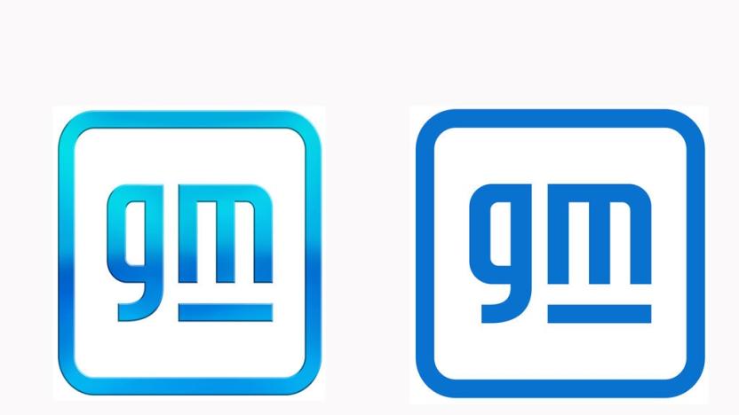
GM modernizes its logo to highlight its EV-centric future
Look closely, and you might spot the shape of an electrical plug in there.
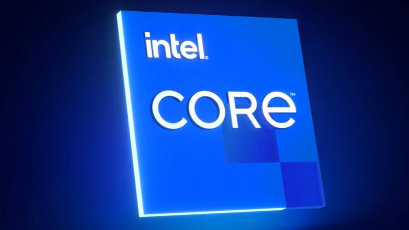
Intel revamps its logo and five-note audio signature
Intel last changed its logo in 2006, but now it has a new look and soon it will have a "modernized" new sound.
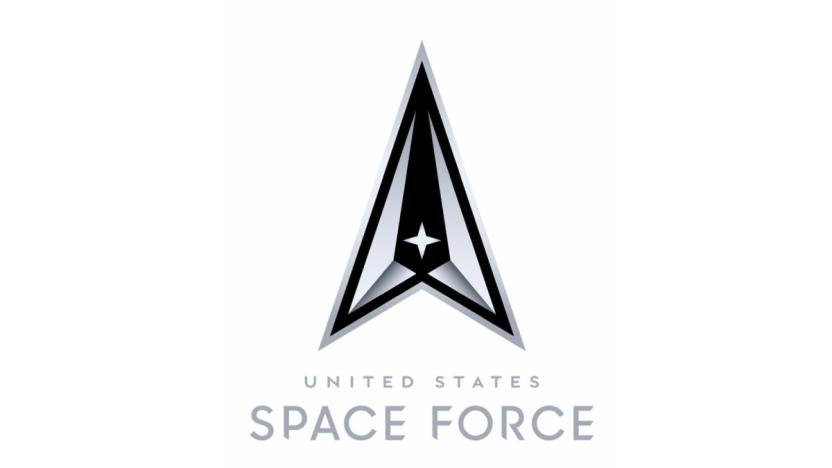
Space Force official logo and motto unveiled
This is the official logo for the United States Space Force.

Watch Sony's CES 2020 press conference in nine minutes
Sony made a leftfield announcement at CES today -- it's made a car. With help from Bosch, NVIDIA and Qualcomm the company has created its first prototype vehicle under its Vision-S initiative -- pipping the likes of Google and Apple, which have been talking about doing something similar, to the post. It is, predictably, loaded with sensors and other Sony tech.

OnePlus' upcoming TV will simply be called the 'OnePlus TV'
OnePlus doesn't have a release date or any specs for its upcoming TV, but it does have a name: OnePlus TV. The company announced that it chose the very simple moniker from multiple winners of a contest on its forums. "We believe there's no other name that can best represent our value, vision and pride than naming it with our own brand," said a representative.

Mozilla's new Firefox logo shows it's more than just a browser
The iconic Firefox logo has fronted Mozilla's services since 2003 -- now, 16 years later, it's getting a complete makeover. In a blog post published today, the company reveals that it's been working on a new design for the last 18 months in a bid to create iconography that shows it's more than just a browser.
Google Search redesign adds website names and logos to results page
Google is bringing a new Search layout to mobile, and it's rolling out the changes beginning today. Now, when you search on your mobile device, you'll see a website name and logo at the top of each results card. If Google has a "useful ad" to show you, it will appear with a bolded ad label and the web address. The new design will also allow Google to add new actions, like the ability to buy movie tickets or play podcasts, to the results page.
This funky new font is made up entirely of brands
A digital studio called Hello Velocity has created a typeface that embraces well-known corporate logos and is still somehow far less annoying than Comic Sans. The studio says it creates "thought-provoking internet experiences," and its Brand New Roman font is a clever statement on consumerism.
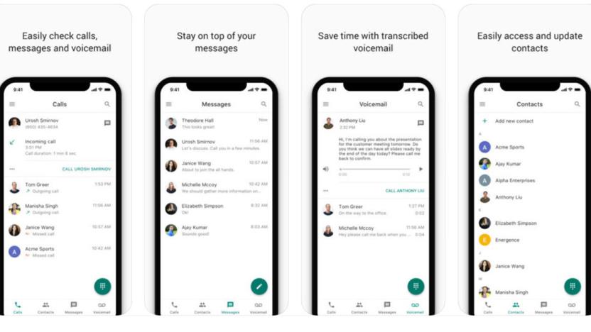
Google's redesigned Voice app is better at juggling your calls
Google recently added Voice to its enterprise G Suite, and the revamped app has now arrived for iOS users. As suggested by the redesigned icon (which strongly resembles the Hangouts Dialer icon), its main job is to give users calling features via standard telephony over and above what you'd expect on regular apps. As such, it can do things like email you about missed calls, transcribe messages, enable "do not disturb" based on your working hours and access contacts stored elsewhere in G Suite.
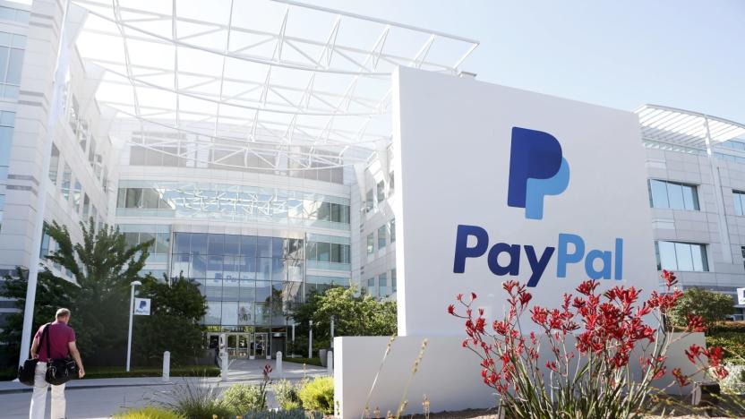
PayPal sues Pandora over confusingly similar logos
Back in October, Pandora donned a new look and launched a new logo that looked very familiar to anyone who's ever used PayPal before. Now the online payment system is taking Pandora to court, accusing it of ripping off its iconic logo to ride on its popularity. It had some savage words for the music streaming service in the lawsuit it filed, telling the court that Pandora decided on a logo design similar to its own to overcome "serious commercial challenges that threaten its very survival." After all, the filing reads, "Pandora has no obvious path to profitability" as a streaming website known for free service, and it also faces "overwhelming competition from Spotify, Apple Music and Amazon Music."

Mozilla's new logo is kinda ://
It's been six months since Mozilla, the non-profit organization in charge of maintaining Firefox, announced it was putting the future of its brand in users' hands. Kinda, at least. The plan was to solicit entrants for a new wordmark or logo, before handing them off to in-house professionals to finish off the job. After some pretty out-there submissions -- including one that would have seen a revival of Mozilla's once-famous dinosaur -- the winning design is markedly plain.

Google Play apps are getting more unified logo designs
The new logo and wordmark that Google unveiled last fall marked probably the biggest visual revamp in the company's history, and now Google Play's logos are getting a bit of a facelift. The logos for Google Play and the Play Store have been tweaked slightly, but the rest of the icons for Play stores and services (like movies / TV, music, books and games) all have been radically redesigned. Now, every icon has a silhouette of the "play" button as well as a visual indicator of the media type in question.

Uber updates its look
Uber has new app icons, a fresh logotype, and region-specific background colors and patterns, company co-founder Travis Kalanick shows off in a blog post today. The new icons for both the rider and partner apps include a "bit" at their centers, a hollowed-out square that represents the company's technology. Plus, they feature colors and patterns specific to whichever country you're in. The Uber team crafted these colorful backgrounds by studying the architecture, art, fashion and environments of the relevant regions, but eventually the company plans to go even further and create custom patterns for individual cities.
Recommended Reading: The story behind Google's new logo
Recommended Reading highlights the best long-form writing on technology and more in print and on the web. Some weeks, you'll also find short reviews of books that we think are worth your time. We hope you enjoy the read. Evolving the Google Identity by Alex Cook, Jonathan Jarvis and Jonathan Lee Google Design Google grabbed the internet's attention earlier this week with a brand-new logo. With a design that's quite a departure from the previous mark, the company has its eye on the future in more ways than one. Here's a look behind the scenes at the finer details of the new logotype.
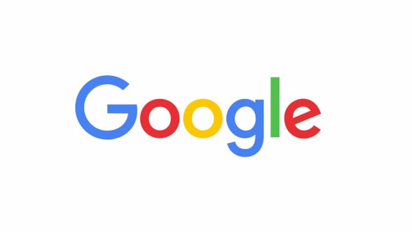
This is Google's new logo
Google has a new logo. A few weeks after the company announced a huge restructuring effort that will split the search, advertising and internet giant into several different organizations, the new Google is showing off a new identity. The iconic four colors and "Google" over a white background remains unchanged, but the font is significantly different, removing the serifs that have been part of the letters for years. All in all, it's a flatter, slightly more modern design -- one that also evokes the company's new Alphabet logo -- but it'll certainly take some getting used to.

Facebook has a new logo, but the differences are subtle
Facebook's last logo update came in 2005, but this year, the folks in Menlo Park felt it was time for a change. While the iconic white "f" and blue square will remain, places where the full name is used will see this new wordmark. Working with Eric Olson of Process Type Foundry, Facebook's in-house designers created custom lettering to make the logo "feel more friendly and approachable," according to creative director Josh Higgins. Olson's Klavika typeface was used in the current mark, and collaborating with him makes sense given the changes. "While we explored many directions, ultimately we decided that we only needed an update, and not a full redesign," Higgins explained. That decision seems like a good move, since the current logo is so recognizable after 10 years of use.

Logoist 2: Designing logos and more on your Mac
Small business owners, website developers, and others often have a need to design logos, business cards, and more, but can't afford to hire a professional designer to do the work. While designers are your best bet for getting a logo or other artwork that can truly "sell" your business to customers, the recently updated Logoist 2.1 ($29.99, on sale through December 27, 2014 for $14.99) can help you to easily create good-looking, professional illustrations or images. The OS X app is fully optimized for OS X Yosemite, and creates files as images in PNG, JPEG, PSD, and PDF formats. But before you can output your images, you need to create them... Launching Logoist 2.1 displays a splash screen with a showcase of different designs, all of which can be used as a starting place for creating your own work. If you're looking more for a specific type of graphic item - say a logo, greeting card, business card or photo layout - there are tabs for those items as well. You don't have to use the presets, but they may be useful in getting your creative juices flowing. Selecting a preset brings up the example in a separate window that can be expanded to full screen if desired. On those presets you'll see several animated dots - clicking on those allows you to change some of the major features of a specific design. For example, one simple calligraphy logo had one dot for changing the text, while another dot changed the background color. But what if I wanted to do more than just change the text and background color? Well, there's a button to create a new document from the preset, and once that's been created a full editor comes into view. Want to change the text style or rotation? Done. Add shapes, lines, paths? It's in the controls. There are buttons for adding clip art or images, and specific items can be layered for depth or to mask out other items. I found it fascinating that individual letters in a logo could not only be rotated, but that I had total control over items such as line height and kerning. Style changes include fills, motion blurs, borders, a ton of effects from bevels to shadows, and even a "set distorter" to force perspective or warp words. There are so many choices that Logoist 2.1 provides a browser of style presets that you can try out, scrolling through gradients, flat colors, glows, plastic, glossy or glassy extrusions, or even metallic looks. All said, it's possible to make some really hideous choices like the faux TUAW logo seen at the top of the page. Clip art can be added in at any point along with images, and there are a number of combine effects for melding graphic and textual elements. As with most graphic apps, you'll want to be sure to take some time to learn the app so that you don't create nightmares like I did for the examples in this post. That's where the Logoist 2.1 User Guide comes in handy - it's a 51 page PDF document that outlines many of the techniques that you'll want to know in order to master the app. Anyone who needs an app that can help them design logos and cards - or at least show them that they need a professional designer's help - should jump on purchasing Logoist 2.1 while it's on sale through December 27, 2014. It's a powerful tool that can produce great results in the hands of those who learn its tricks and can show restraint.

Microsoft is finally dropping the 'Nokia' from Lumia
Over a year after the acquisition was first announced, Microsoft is officially replacing the Nokia Lumia brand. In a blog post today, the software giant revealed its upcoming smartphones will now be known as Microsoft Lumia. The new Microsoft branding will appear on future phones from the company, with a plain black version of the company's four-squared logo also set to make an appearance.

Netflix's website is suddenly sporting a fresh logo and brighter background
Netflix started tagging some of its trailers with a new logo around the start of May, and now it's part of changes on the streaming movie service's main website. The redesigned logo has replaced its predecessor at the top left, and the background is brighter than the last big redesign we can recall. A quick scan of apps on our various devices didn't show any changes there, and company spokesman Joris Evers tells us simply "The updated logo is gradually appearing in more places." So, are you as much of a fan of the new look as we are of The Magic School Bus? [Thanks, Colton!]


